Hsi-Hsiang International Co., Ltd. | Corporate Outdoor Signage Design & Fabrication Case
Selected Works
A Corporate Frontage Is the Most Direct Form of Trust
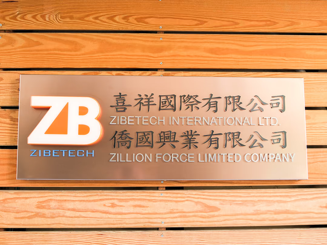
CHYIHAUR delivered a corporate outdoor signage project for Hsi-Hsiang International Co., Ltd., handling everything from identity visual planning and sign design and fabrication to on-site installation. The result presents the company name clearly on the building facade, conveying professionalism and trust through a steady, consistent frontage.
Year
2024
Project Planning & Execution
CHYIHAUR Team
For a company, the sign mounted on its building facade is a permanent business card—the first thing clients, suppliers, and partners see on arrival. Hsi-Hsiang International Co., Ltd. entrusted CHYIHAUR with its outdoor signage project, aiming to present the corporate identity with a clear, professional presence.
01
Project Background & Challenge
Hsi-Hsiang International Co., Ltd. needed an outdoor sign that would represent its corporate image: the company name had to be clearly legible on the facade, the look had to be professional and steady, and it had to withstand long-term outdoor exposure. A sign does more than mark a location—it is the visitor's first read on a company's professionalism. Making the frontage both clearly readable and reliably credible was the focus of this project.
Proportion Before Form
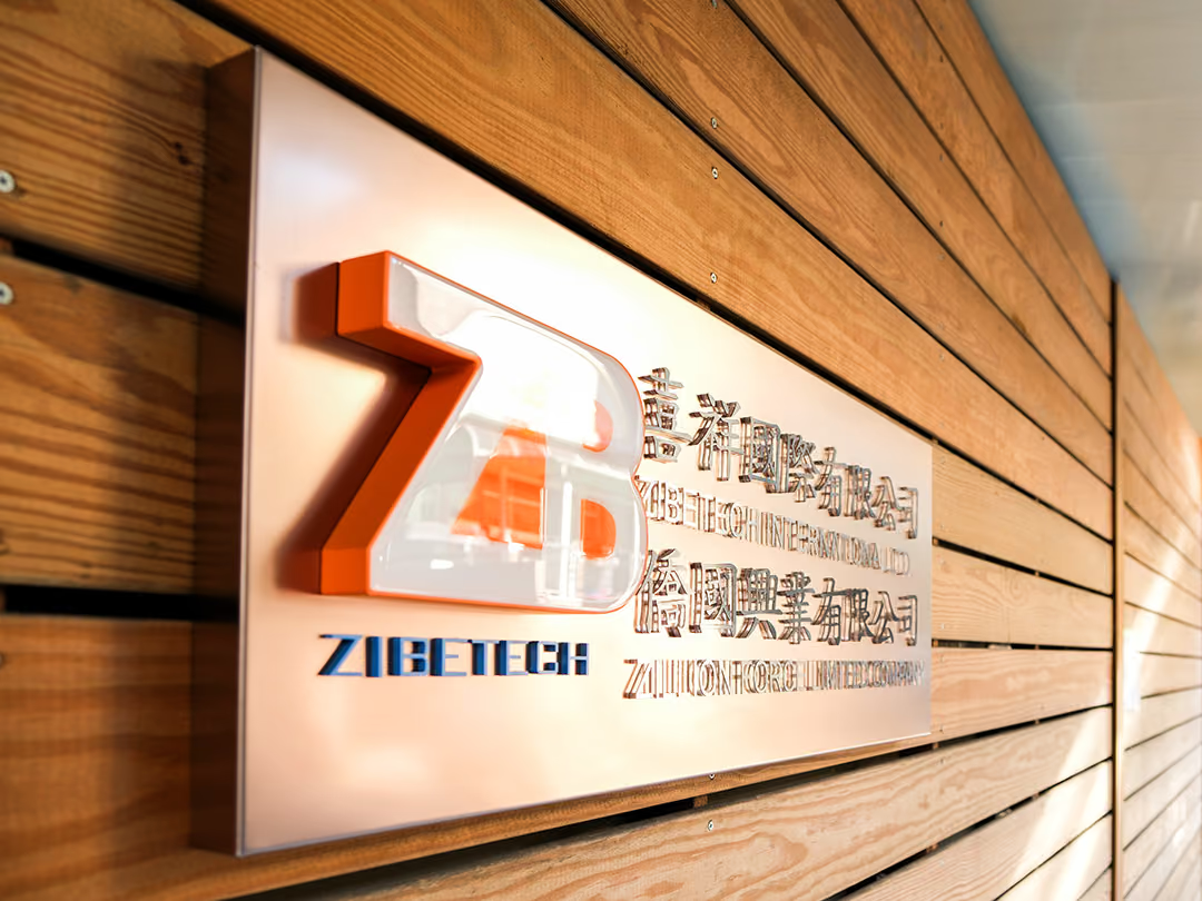
The horizontal seams of the plank wall are strong lines in their own right, and letters set straight onto them get chopped up when seen from a distance. So the proportion and position of the lettering were fixed against the facade first, then a single pale backing plate was used to lift the company name clear of the grain. On an angled approach the name is read before you reach the door, rather than the material being read first.
02
Design Goals & Strategy
We worked to three principles—clear, steady, and timeless. First we established the proportion and placement of the company name lettering on the facade to ensure readability from every angle and distance; visually we kept a clean, understated corporate tone with no superfluous ornament; and fabrication and installation were planned around outdoor conditions so the sign would keep its frontage in good shape for the long term.

Depth Holds the Outline
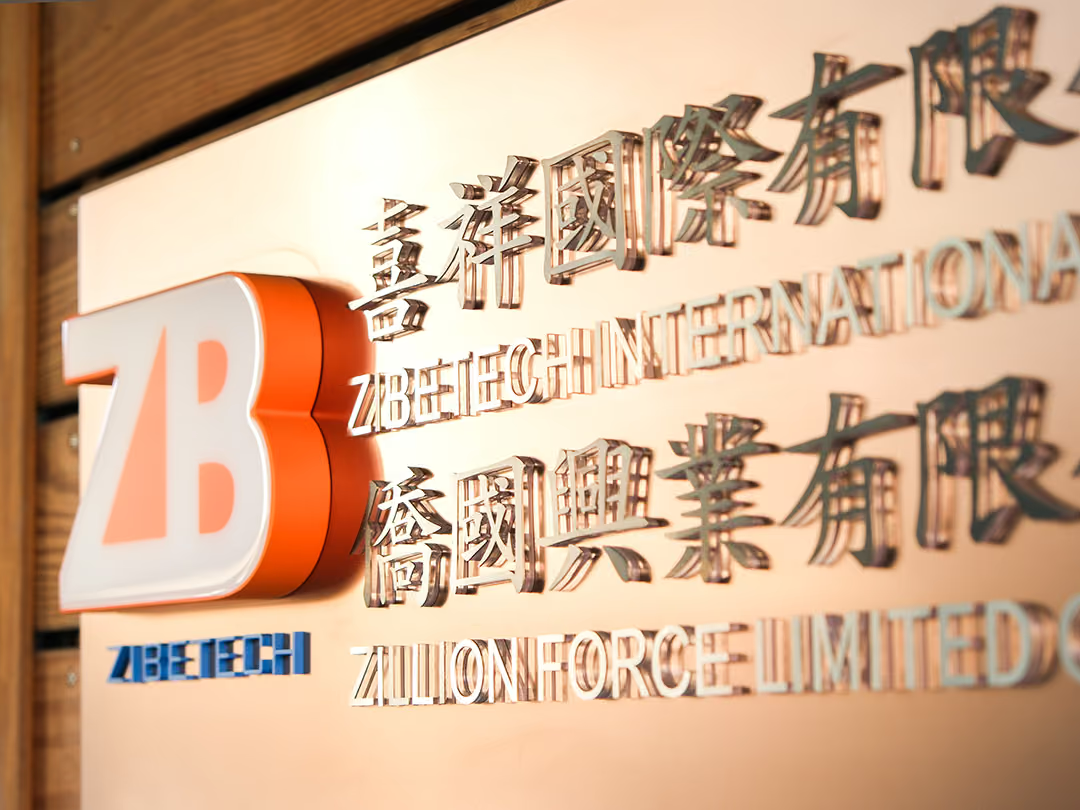
White letters on a grey plate lose their edge the moment the sun shifts. The mark was given depth instead: the orange returns keep one solid line down each side, so the white face still has a boundary even when it catches glare — and beyond the orange triangle inside the Z, nothing decorative was added.
- 01Outdoor Sign DesignCorporate identity lettering planning and visual layout on the building facade.
- 02Sign FabricationFabricating the outdoor sign to the drawings, built for outdoor conditions.
- 03On-Site InstallationOn-site positioning, installation, and finishing to ensure completion quality.
One System, Two Names
Two companies share the same wall, so the mirror-finish letters reuse one type size and line spacing — the two names read as one system rather than something bolted on afterwards.
03
Project Outcome
On completion, Hsi-Hsiang International's company name reads clearly on the building facade, with a clean, steady frontage that aligns with the corporate image. Visitors can identify the company's location at a glance, and the sign has become the firm's most direct outward-facing image—laying the first layer of a professional impression.
Learn More
FAQ
This is a corporate outdoor signage project CHYIHAUR delivered for Hsi-Hsiang International Co., Ltd. The scope covered sign visual design, fabrication, and on-site installation, presenting the corporate identity clearly and professionally on the building facade.
In corporate projects like Hsi-Hsiang International, CHYIHAUR's approach follows the principles of clear, steady, and timeless. The focus is on conveying professionalism and trust rather than eye-catching promotion. Lettering proportion, readable distance, and harmony with the overall facade are the core of corporate sign design.
For the Hsi-Hsiang International case, CHYIHAUR provided one-stop service across outdoor sign design, fabrication, and on-site installation. From the facade layout of the corporate identity and drawing confirmation to on-site construction, a single team handled the whole process, ensuring the finished work matched the plan.
If your company is planning corporate outdoor signage or a frontage image project, Hsi-Hsiang International is a practical reference case. Reach out to CHYIHAUR via the "Contact Us" page on our official website, and the team will provide planning advice and a quote based on your building and facade conditions.
For the Hsi-Hsiang International case, CHYIHAUR planned fabrication together with on-site installation around outdoor conditions, so that the sign would keep the frontage in good shape well after completion. On site, positioning, installation, then finishing were each confirmed in turn, placing the company name exactly where the design stage had set it on the facade, so the finished quality matched the drawings.
Other Cases
Other Cases
These projects may not headline our portfolio, yet each reflects the same commitment CHYIHAUR brings to brand and space.
Whatever the scale, every piece is held to the same standard — so each sign, each installation, becomes a definitive mark the brand leaves on the city.