vacanza Jewelry Store Titanium-Plated Rose Gold Sign | Indoor Brand Identity Case
Selected Works
A Rose Gold Finish That Sets Off the Refined Everyday of Fine Jewelry
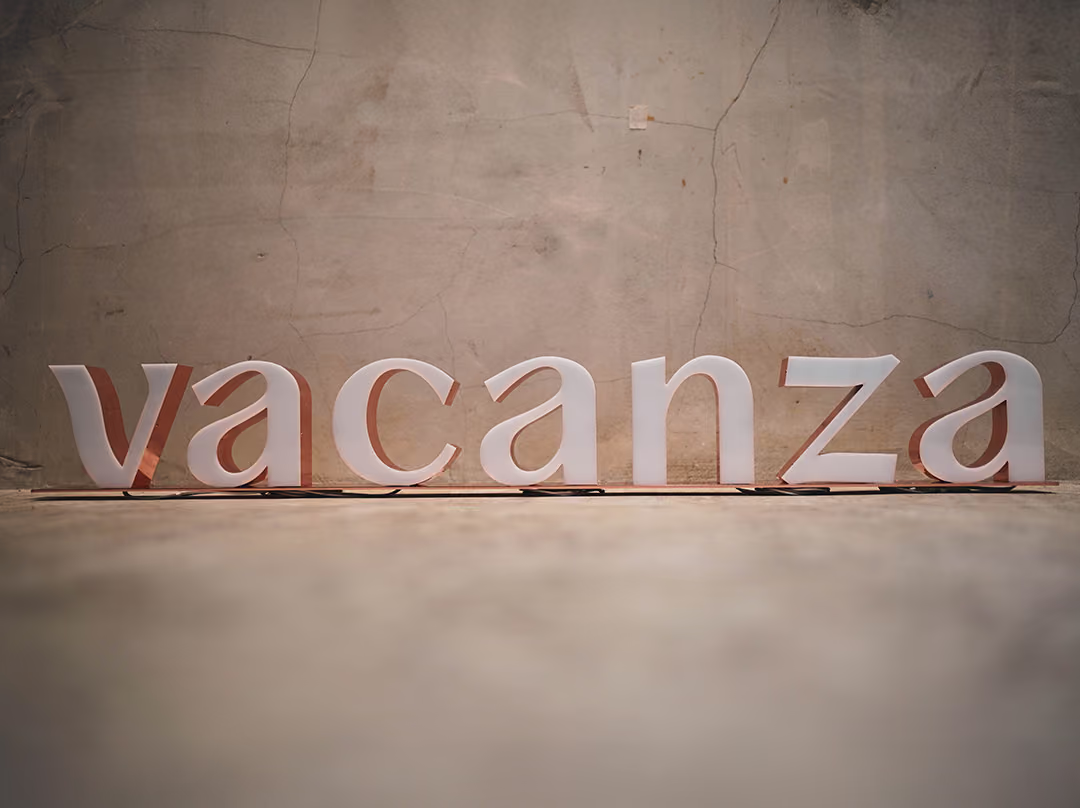
CHYIHAUR crafted the indoor storefront signage for jewelry brand vacanza, rendering the brand identity in a titanium-plated rose gold finish. The metallic luster echoes the refined character of the jewelry brand, turning the sign itself into a piece of jewelry and a brand focal point within the store space that reinforces customers' impression of vacanza.
Year
2021
Project Planning & Execution
CHYIHAUR Team
A jewelry brand sells refinement and texture, so the brand identity inside its stores can be anything but crude. vacanza's indoor sign was rendered in a titanium-plated rose gold finish, one of the most beloved tones in the world of jewelry. CHYIHAUR was responsible for translating this refinement into a physical sign, keeping the brand identity in step with the temperament of the merchandise.
A Brand Sign as Refined as the Jewelry Itself
01
Project Background & Challenge
vacanza is a jewelry brand beloved by younger audiences, displaying its pieces in a refined, gentle store atmosphere. Placing a brand identity into such a space poses a challenge of matching texture: if the sign's finish or craftsmanship were even slightly coarse, it would look out of place amid an environment full of delicate objects. This project chose titanium-plated rose gold as the identity's primary expression, a direct test of manufacturing finesse.

Why Titanium-Plated Rose Gold
vacanza displays its pieces in a delicate, gentle atmosphere, and the hard part of placing an identity in that kind of space is whether the finish can match it. Titanium-plated rose gold was therefore set as the main expression of the identity: the sheen of the metal surface plays off the jewellery on display, so the sign is not a notice hung up afterwards but a piece belonging to the shop.
02
Design Goals & Strategy
Our strategy was to let the sign become a piece on display within the store: presenting the rose gold finish through titanium plating so the metallic surface's luster plays off the jewelry displays, making the brand lettering stand out in the space without stealing the show. Fabrication focused on an even surface treatment and refined edge finishing, ensuring the piece holds up to close scrutiny, precisely what sets a jewelry storefront apart from an ordinary commercial space.
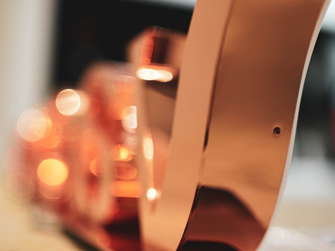
Edges That Survive a Close Look
Customers in a jewellery shop come right up to look, and the curved corners and the area around the screw holes are where roughness shows first. Here the edges were finished one by one, so nothing gives itself away under close inspection.
- 01Indoor Sign FabricationFabrication of the storefront brand identity lettering, presented in a titanium-plated rose gold surface.
- 02Surface TreatmentTitanium plating renders the rose gold finish with an even, refined texture.
- 03On-Site InstallationInstalled to align with the store space, preserving the overall atmosphere.
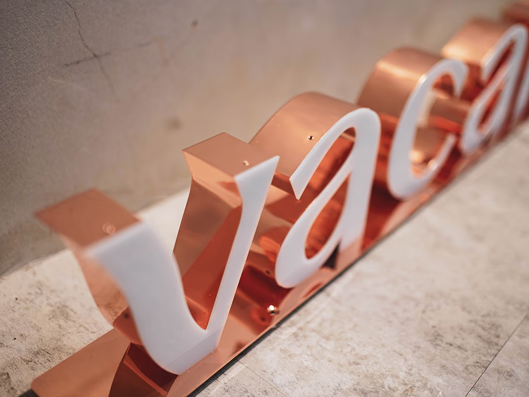
Evenness Under Daylight
Not in the shop yet, the letters have only daylight on them. That light is unforgiving: a single uneven patch in the titanium plating shows straight away.
03
Project Outcome
Once completed, the vacanza storefront identity blended naturally into the store's jewelry displays through its titanium-plated rose gold finish, becoming a soft yet clear brand focal point within the space. When customers step in for a closer look, the metallic surface's texture matches the refinement the brand is known for, making the identity itself part of the in-store experience.
Learn More
FAQ
This is a case in which CHYIHAUR produced the indoor storefront sign for jewelry brand vacanza, rendering the brand identity in a titanium-plated rose gold finish. The metallic luster echoes the refined character of the jewelry brand, making the sign a brand focal point within the store space.
The rose gold finish of the titanium-plated sign shares the color vocabulary of the jewelry merchandise, keeping the brand identity in step with the temperament of the displayed pieces. At the same time, the titanium-plated metallic surface is finely finished and holds up to close scrutiny, meeting the high standard for texture that a jewelry storefront demands.
Indoor signs are viewed at close range under stable lighting, so the emphasis falls on even surface treatment, refined edge finishing, and blending with the spatial atmosphere; outdoor signs place more weight on long-distance legibility and weather resistance. CHYIHAUR adjusts the craft and presentation according to the installation setting.
If you are planning an indoor sign and brand identity for a jewelry or retail storefront, feel free to reach out to CHYIHAUR through the "Contact Us" page on our official website, and the team will provide planning advice and a quote based on your space and texture requirements.
CHYIHAUR's strategy was to let the sign become a piece on display within the store, so that it stands out yet never steals the show in a space filled with delicate objects. During on-site installation, its position was decided according to the store space in order to preserve the overall atmosphere, letting the brand identity itself become part of the in-store experience.
Other Cases
Other Cases
These projects may not headline our portfolio, yet each reflects the same commitment CHYIHAUR brings to brand and space.
Whatever the scale, every piece is held to the same standard — so each sign, each installation, becomes a definitive mark the brand leaves on the city.