THE Chun F&B Brand | Outdoor Signage Design & Storefront Identity Engineering Case
Selected Works
Make everyone who passes remember this "Chun" at a glance
CHYIHAUR crafted the outdoor signage and storefront identity for F&B brand THE Chun, delivering everything from sign design to on-site installation. The brand name reads clear and striking within the streetscape, with a style that lands right, becoming the storefront focal point that draws guests in and makes the brand instantly recognizable, opening a beautiful first impression for the dining space.
Year
2023
Project Planning & Execution
CHYIHAUR Team
For an F&B brand, the sign is a menu before a word is spoken, passers-by decide in a single glance whether to stop. THE Chun's storefront identity needed to be both seen and remembered within a busy streetscape. CHYIHAUR integrated everything from outdoor signage design to installation, turning the brand name into the most self-assured invitation on the street.
01
Project Background & Challenge
The storefront of F&B brand THE Chun sits squarely in the line of sight of passing foot traffic, so the outdoor sign had to stand out among many neighboring shops while staying true to the brand's own style. An F&B sign carries two tasks at once, drawing crowds and establishing identity: play it too safe and it drowns in the streetscape, push it too loud and it clashes with the brand tone. Striking that balance was the core challenge of this project.
The Shopfront in Daylight
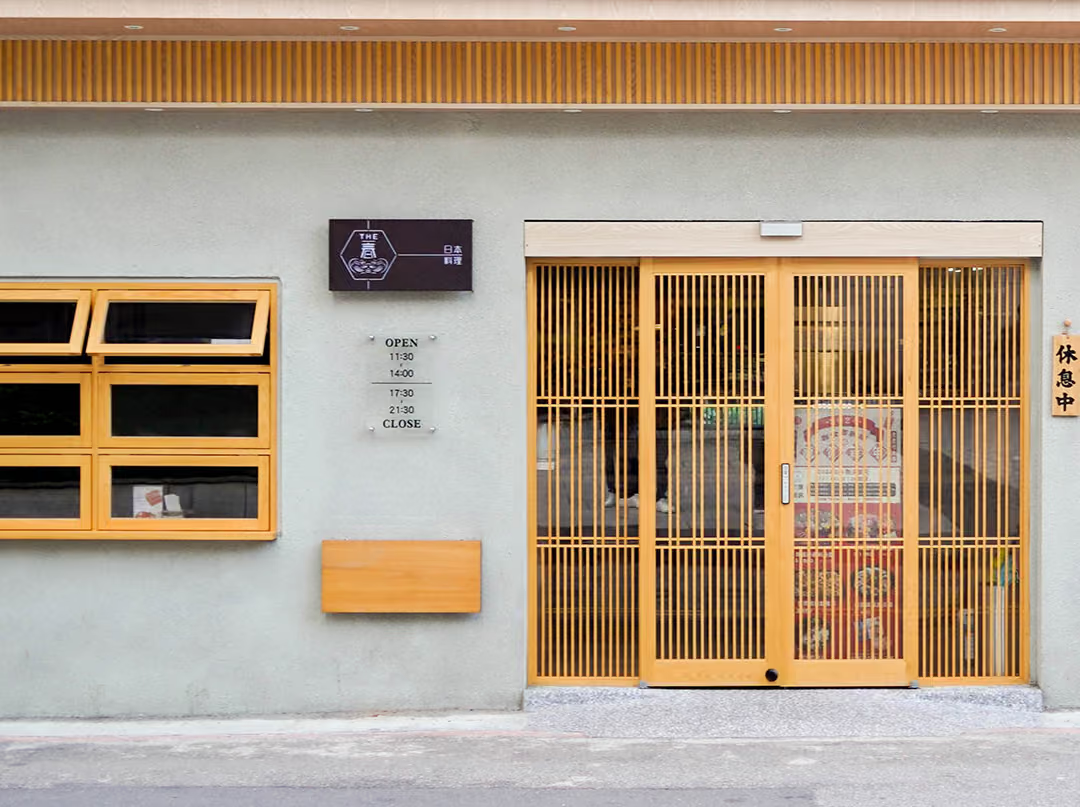
A near-neutral off-white wall keeps the dark brown sign legible in daylight, with no illumination needed. The orange-toned wooden awning window on the left, the pale wood lattice sliding door on the right and the lattice eaves band above gather the sign into one timber vocabulary. At the time of the photo the door is shut and a vertical wooden "closed" tag hangs at the right.
02
Design Goals & Strategy
We planned the storefront identity around a goal of instant recognition with style that lands: making the brand name the visual lead of the sign, with clean, crisp typography and composition that stays clearly legible by day and by night. From design and fabrication to on-site installation, the CHYIHAUR team executed it all in one hand, ensuring the finished result matched the design drawings.
Fine Lines of the Hexagon Mark
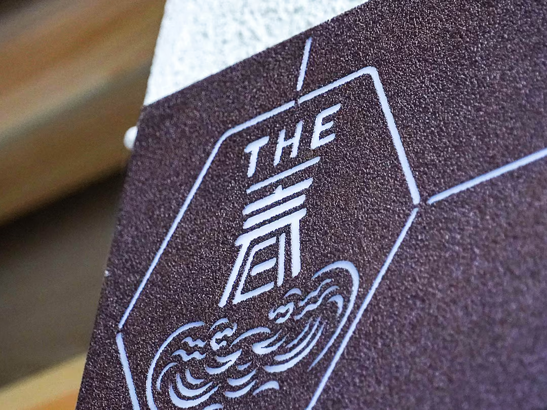
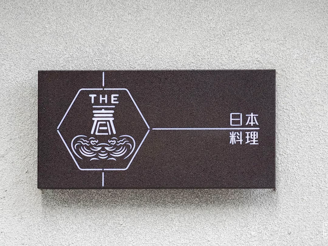
Thin white lines draw a hexagonal frame on the matte dark brown face, stacking THE, the character 春 and a scrolling cloud motif in one vertical column, then run a single line rightward to the Japanese-cuisine wording. Shadow along the lower and right edges shows this is a box panel with real depth.
- 01Outdoor Signage DesignStorefront sign visual planning that balances streetside recognition with brand style.
- 02Sign FabricationFabricated to the design specifications, faithfully rendering the brand identity.
- 03On-site InstallationOn-site positioning and installation to ensure the best presentation of viewing angle and height.
Hours Plate Held Off the Wall
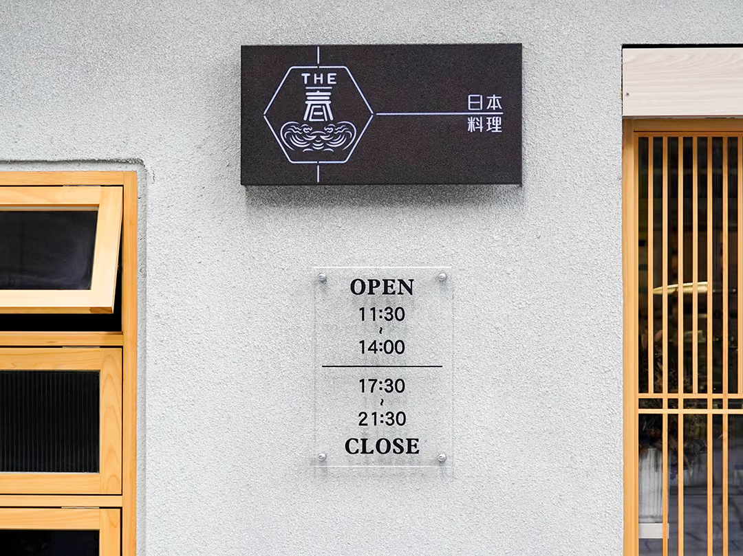
Directly below the sign sits a clear acrylic hours plate, screwed at all four corners to stand off the wall, with a rule separating the midday and evening service periods.
03
Project Outcome
With the work complete, THE Chun's storefront now carries its brand name clear and striking within the streetscape, and the sign has become the first point of contact for passers-by getting to know the brand. The clean visual gives the storefront a style of its own, conveying the brand's personality without extra ornament, and establishing an identity focal point for the dining space that is easy to recognize, easy to remember, and easy to photograph.
Learn More
FAQ
This is an outdoor signage and storefront identity case that CHYIHAUR carried out for F&B brand THE Chun in 2023. The project was executed end to end, from sign design and fabrication to on-site installation, making the brand name a clear, striking identity focal point on the street.
The services CHYIHAUR provided for THE Chun included outdoor signage design, sign fabrication, and on-site installation, delivered by a single team in one hand from drawing to completion.
An F&B brand's outdoor sign has to be both seen and remembered: it needs enough recognition within the streetscape, while its typography and composition must echo the brand style and stay clearly presented by day and night. In the THE Chun case, CHYIHAUR balanced crowd-drawing appeal with brand tone on exactly this principle.
The basic flow of a signage project is finalizing the design, fabricating to specification, then positioning and installing on site. CHYIHAUR runs the entire process with a single team, ensuring the finished result faithfully reproduces the design and reducing the gaps caused by cross-vendor communication.
If you are planning the signage design and installation for an F&B storefront, you are welcome to reach out to CHYIHAUR through the "Contact Us" page on the official website. The team will provide planning advice and a quote based on your storefront conditions.
Other Cases
Other Cases
These projects may not headline our portfolio, yet each reflects the same commitment CHYIHAUR brings to brand and space.
Whatever the scale, every piece is held to the same standard — so each sign, each installation, becomes a definitive mark the brand leaves on the city.