The Diner | Outdoor Storefront Signage Design & Fabrication for an American Diner
Selected Works
Bringing the warmth of the American table to the streetfront facade
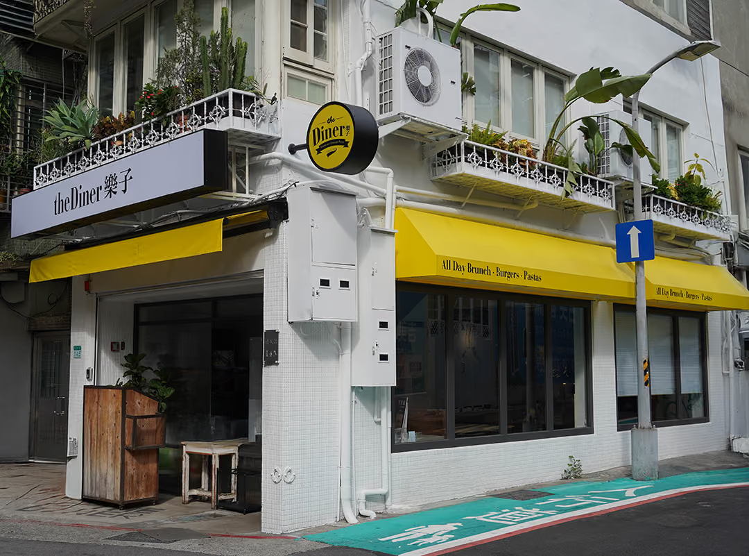
CHYIHAUR designed and fabricated the outdoor storefront signage for American diner brand The Diner, translating its brand identity into a striking street-facing facade that unifies the visual impression, sharpens recognition among passing foot traffic, and makes the store easy to spot in a busy commercial district.
Year
2022
Project Design & Execution
CHYIHAUR Team
For a restaurant, the outdoor sign is the first course a customer tastes before ever stepping inside. Beloved for its authentic American fare, The Diner needed storefront signage that carried the brand's bold personality onto the street while staying clearly legible amid a dense row of commercial facades. CHYIHAUR started from the brand identity to design, fabricate, and install the outdoor storefront signage.
01
Project Background & Challenge
The Diner is an American restaurant brand well loved by diners, with stores mostly set along busy commercial streets. In this kind of facade environment, signs compete for attention, and a brand with unclear or cluttered identity is easily drowned out. The challenge here was to translate the brand identity faithfully onto the outdoor signage, so the storefront holds a consistent, clear brand impression both by day and by night.
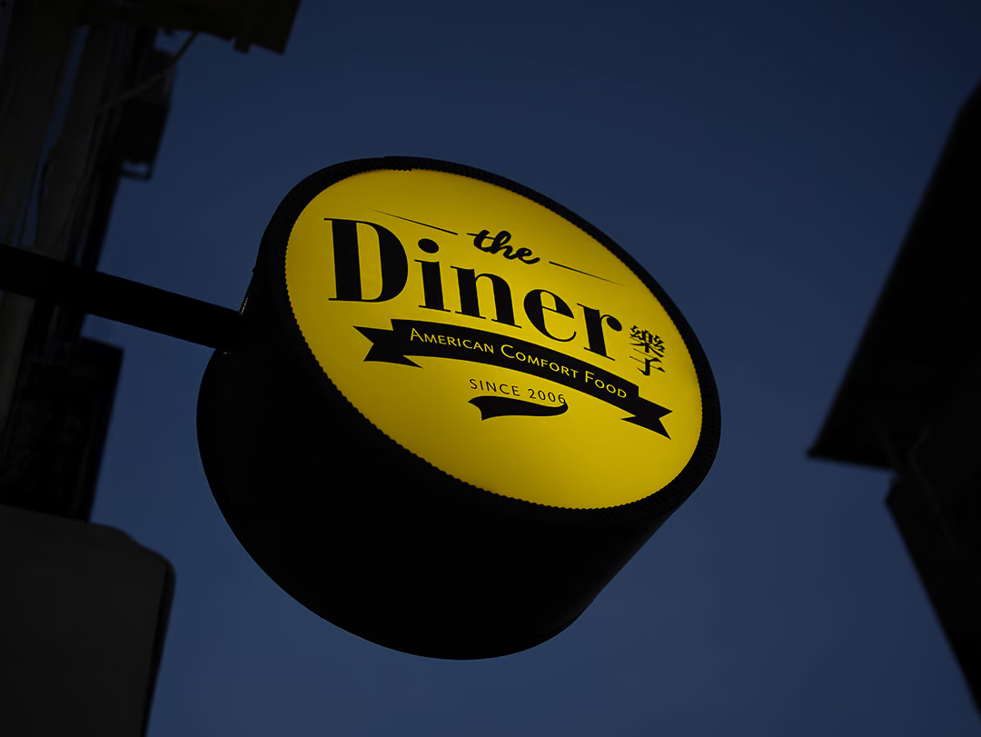
A side-projecting double face
On a busy commercial street signs compete face-on, and a flush-mounted one is often only readable once you reach the door. This one projects from the side wall with two faces, so people and traffic approaching from either direction read the name before they arrive. In the layout the name is given the greatest weight while the ribbon sub-line and the year sit a level below, so at driving distance only one group of letters has to be recognised. At night the lit face carries the identity on its own rather than relying on ambient light, keeping the same impression by day and after dark.
02
Design Goals & Strategy
We set out to make the sign "recognizable at a glance, clear from near and far": built around the brand's standard identity, with typography proportions and layout hierarchy controlled so the store name reads quickly at both walking distance and driving distance. At the same time we integrated the overall facade so sign and storefront speak with one voice, preserving the bold personality and street presence an American diner deserves.
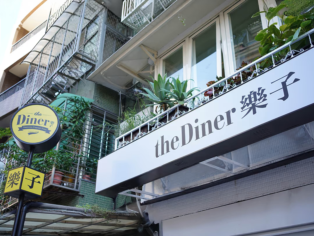
The storefront with the lights off
By day the faces are unlit, so recognition rests on layout and contrast alone. The sign sits in this narrow band under the balcony, with the railing above it packed with potted plants; black lettering on a white panel first clears a clean field to read from, and setting the Chinese and English side by side rather than stacking them keeps it to a single line the eye can sweep.
- 01Signage Visual PlanningPlanned the layout, proportions, and presentation of the outdoor signage in line with the brand identity.
- 02Outdoor Signage FabricationFabricated the storefront outdoor signage, faithfully reproducing the brand identity.
- 03On-Site InstallationPositioned and installed to suit the conditions of the storefront facade.

The last few steps to the door
Up close the constraint is no longer distance but the width of the face. Each face carries a single Chinese character, trading the whole width for size, so a passer-by does not have to step back to read it.
03
Project Outcome
On completion, The Diner storefront shows outdoor signage in full alignment with the brand identity, markedly improving street-level recognition so passersby quickly identify the brand and find the entrance. The unified facade also makes the brand image stand out more sharply within the commercial district, becoming the frontline force that draws customers to the store.
Learn More
FAQ
This is an outdoor storefront signage design and fabrication case that CHYIHAUR carried out for the American diner brand The Diner. The project translated the brand identity into a street-facing storefront sign, unifying the visual impression and sharpening recognition within the commercial district.
In the The Diner case, CHYIHAUR provided the full outdoor signage design service, covering signage visual planning, outdoor signage fabrication, and on-site installation, with one team handling everything from design to completion.
Outdoor signage design for a dining storefront hinges on brand recognition and legibility, and CHYIHAUR controls the sign's proportions, type size, and visual hierarchy according to the commercial setting and facade conditions. The aim is to let customers quickly recognize the brand and find the store entrance at both walking and driving distance.
If you are planning the outdoor signage design and fabrication for a dining storefront, feel free to reach CHYIHAUR through the "Contact Us" page on the official website. The team will offer planning advice and a quote based on your store location and facade conditions.
The Diner's stores sit along busy commercial streets where signs compete for attention, so the challenge was to hold a consistent, clear brand impression on the storefront by day as well as by night. At the design stage CHYIHAUR integrated the overall facade visual, keeping the sign from speaking a different language than the storefront, preserving the bold personality and street presence an American diner deserves.
Other Cases
Other Cases
These projects may not headline our portfolio, yet each reflects the same commitment CHYIHAUR brings to brand and space.
Whatever the scale, every piece is held to the same standard — so each sign, each installation, becomes a definitive mark the brand leaves on the city.