Studio 13 Beauty Studio | Outdoor Signage & Interior Identity Design Case
Selected Works
From Facade to Interior, One Consistent Aesthetic First Impression
CHYIHAUR planned the storefront identity for beauty brand Studio 13, integrating everything from outdoor signage to interior signage in a single effort. The brand carries one consistent visual tone from the streetside facade into the interior space, giving the studio a memorable, enduring first impression.
Year
2023
Project Planning & Execution
CHYIHAUR Team
In the beauty industry, clients start judging a salon before they even step inside. Studio 13 needed more than a visible sign; it needed an identity with a consistent tone that reaches from the streetside facade into the interior space. CHYIHAUR planned everything from outdoor to interior signage in one pass, so the brand's aesthetic speaks before the client arrives.
01
Project Background & Challenges
The storefront identity for beauty brand Studio 13 faced the industry's most practical dilemma: clients care deeply about first impressions and spatial atmosphere, so the sign has to be clearly visible from the street yet never so loud that it undermines the brand's refinement. Handling the outdoor and interior separately easily creates a gap, one look on the facade and another inside, weakening the brand's sense of cohesion.
Read Far, Read Near
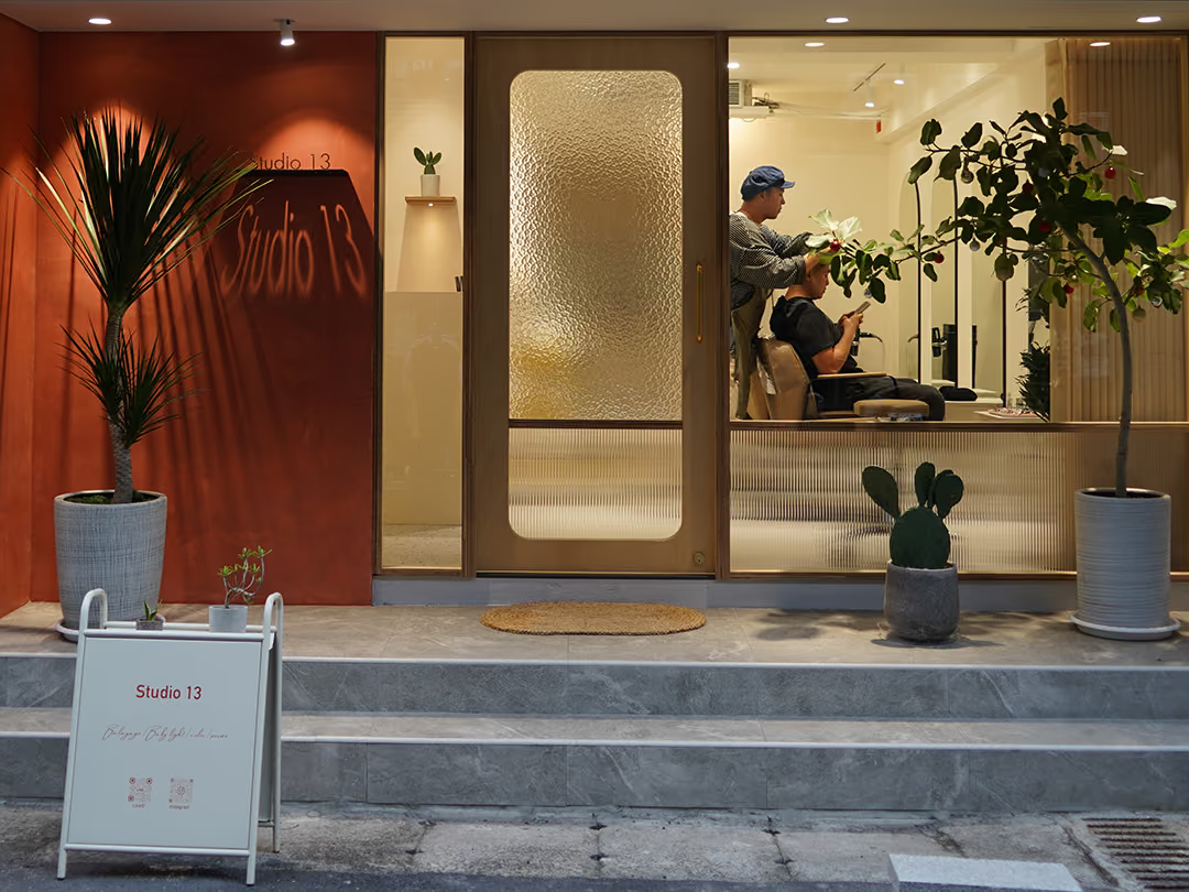
A beauty storefront is hard to pitch: not eye-catching enough and the street swallows it, too bright and the sense of quality goes first. Out on the street the wall keeps only the name: the enlarged script sits at almost the same brightness as the lit wall, so what does the work is its size, not its brightness. Everything that needs closer reading moves to the white A-frame at the door, which carries a line of handwritten script and two QR codes, taking over once you are close.
02
Design Goals & Strategy
We planned the outdoor and interior as a single identity system: the outdoor sign handles recognition and drawing footfall, presenting the brand name cleanly and clearly against the streetscape; the interior signage carries the facade's visual language forward, bringing the brand's tone into the service space. Design, fabrication, and installation were all handled by the same team, ensuring the inside and outside stay perfectly in sync.
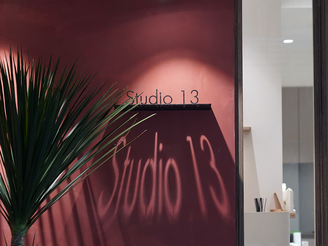
An Unevenly Lit Wall
A band of warm light spreads downward from the top of the deep wine-red wall, and the leaves on the left draw out several long, thin shadow stripes: the light across this wall is not even. Inside the polygonal dark area below the horizontal bar, the strokes of the script read clearly brighter than what surrounds them, and it is that difference in light and dark that holds the letters up.
- 01Outdoor Signage DesignVisual planning and fabrication of the facade sign, balancing recognizability with brand refinement.
- 02Interior Identity PlanningInterior signage carries the facade's tone forward, unifying the brand's visual language.
- 03On-Site InstallationOutdoor and interior identity installed as one, ensuring consistent finished quality.
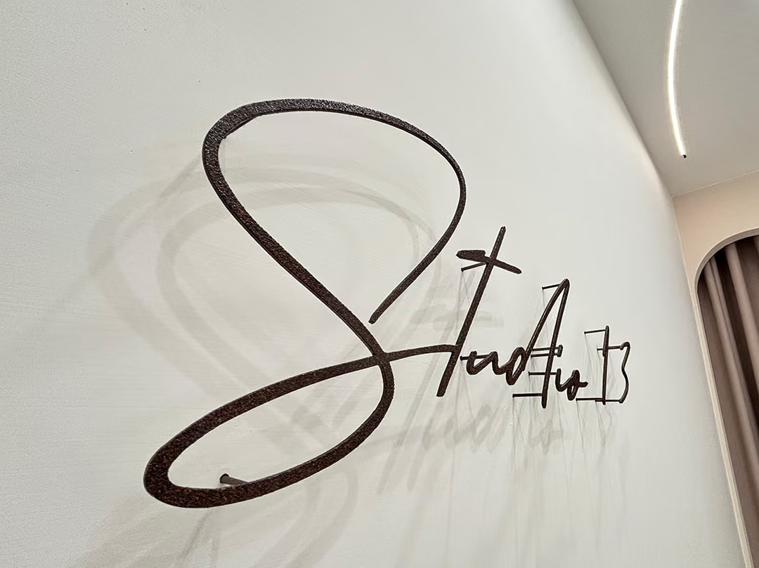
Light Lands on the Wall
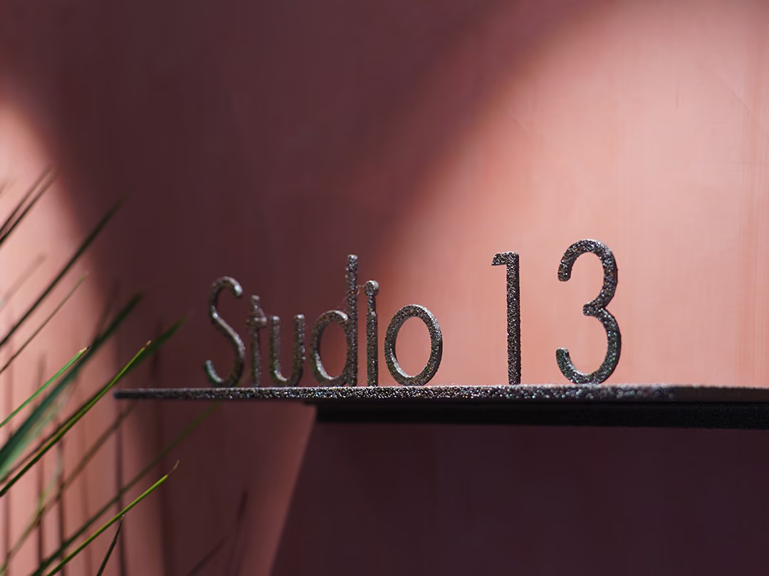
The same script carries indoors, where the letter faces have a matte, coarse-grained surface. The linear ceiling light comes down and leaves only a soft, faint shadow on the wall, with no hot spot across the letters.
03
Project Results
With Studio 13 complete, the brand's visuals read consistently from the streetside facade into the interior space. From spotting the sign to walking in to receiving service, clients take in one unified aesthetic language. For a beauty brand where first impressions decide everything, this fully integrated identity became the storefront's quietest yet most effective tool for winning clients.
Learn More
FAQ
This is a storefront identity case CHYIHAUR completed for beauty brand Studio 13 in 2023, covering both outdoor and interior signage. The project planned the facade and interior as a single identity system, keeping the brand's visuals consistent from the streetside all the way into the service space.
The services CHYIHAUR provided for Studio 13 include outdoor signage design, interior identity planning, and on-site installation, with design, fabrication, and installation all handled by the same team.
The key to signage design for a beauty studio is balancing recognizability with refinement: the sign must be clearly visible from the street while its look echoes the brand's aesthetic tone, avoiding anything so loud it disrupts the atmosphere. In the Studio 13 case, CHYIHAUR integrated the facade and interior identity around exactly this principle.
Planning the outdoor and interior signage together ensures the brand's visual language stays consistent from the facade to the interior, sparing clients any jarring shift in tone once they step inside. Having the same team handle design and installation also keeps material presentation and finished quality more consistent.
If you're planning signage and identity work for a beauty storefront, reach out to CHYIHAUR via the "Contact Us" page on our official website, and the team will provide planning advice and a quote based on your storefront's conditions.
Other Cases
Other Cases
These projects may not headline our portfolio, yet each reflects the same commitment CHYIHAUR brings to brand and space.
Whatever the scale, every piece is held to the same standard — so each sign, each installation, becomes a definitive mark the brand leaves on the city.