Xin Yuan Restaurant Brand | Interior Signage & Spatial Identity Case
Selected Works
Hanging the warmth of a brand into the dining space
CHYIHAUR planned the interior signage and spatial identity for the restaurant brand Xin Yuan, letting the brand name and visual elements blend naturally into the dining environment. Balancing atmosphere with legibility, we leave guests with a consistent, warm brand impression and give the dining space more memorability and story.
Year
2023
Project Planning & Execution
CHYIHAUR Team
The identity of a dining space is more than the sign above the door—once guests sit down, it is the interior identity around them that lets the brand impression take hold. Xin Yuan's interior signage had to let the brand name live naturally within the dining environment: never stealing the scene, yet always remembered. From visual design to installation, CHYIHAUR hung the warmth of the brand into the space.
01
Background & Challenge
The restaurant brand Xin Yuan cares deeply about the atmosphere of its dining space, so interior signage could not simply be "the shop name hung on a wall"—it had to become part of the space itself. The challenge lay in judging the measure: too faint an identity and guests forget the brand once they leave; too strong a presence and it disrupts the comfort of the meal. The interior identity had to sit in harmony with the materials and lighting of the space.
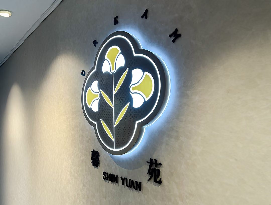
Calibrating Presence
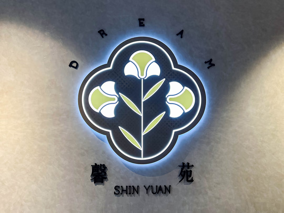
Indoor identity works on a narrow margin: too quiet and the brand is forgotten, too loud and it intrudes on the meal. The light is kept behind the emblem rather than thrown at the diner, while the brand name is carried by solid dimensional lettering. The off-white textured wall pulls the whole set into the material vocabulary the interior already uses, so guests pause on it without feeling a lamp has been added to the room.
02
Design Goals & Strategy
We planned the interior identity on the principle of "blending in without disappearing": the position, proportion and presentation of the brand name were tuned to the visual rhythm of the overall interior, appearing naturally along the guest's line of sight. From design through on-site installation, everything was executed by one team to ensure the identity met the finished surfaces of the space with a consistent fit and quality.

A Second Way to Read It
The same panel has to read as a shape whether it is lit or not, so the layering cannot rest entirely on light: the leaf and petal lines are cut clean through to the pale board beneath, and the tonal difference between the materials holds the outline; the etched dots are made in varying sizes so the texture never settles into one even sheen.
- 01Interior Signage PlanningPosition, proportion and visual planning of the brand identity within the space.
- 02Signage FabricationInterior identity built to the conditions of the space and the design specifications.
- 03On-site InstallationInstalled in step with the interior fit-out to guarantee the quality of the finished surface.
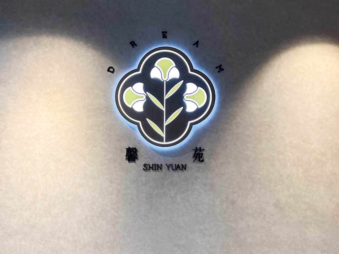
Placed Between the Washes
Position and scale were set against the two light washes on the wall, so the mark sits in the dimmest middle band and never competes head-on; fabrication through installation was handled end to end by one team, so its edges close tight against the finished wall.
03
Project Outcome
Once complete, Xin Yuan's interior signage became one with the dining space: whether seated or moving through the room, guests meet the brand identity naturally, without ever feeling intruded upon. The brand name becomes part of the memory of the space—long after the meal ends, the name Xin Yuan stays with the guest.
Learn More
FAQ
This is an interior signage and spatial identity case that CHYIHAUR executed for the restaurant brand Xin Yuan in 2023. The project let the brand identity blend into the dining environment, balancing atmosphere and legibility to build a consistent brand impression for the space.
CHYIHAUR's services for Xin Yuan included interior signage planning, signage fabrication and on-site installation, all executed by one team in coordination with the interior fit-out.
For interior signage in a dining space, the key is to "blend in without disappearing": the position, proportion and material presentation of the identity should follow the visual rhythm of the interior, appearing naturally along the guest's path—neither disturbing the dining atmosphere nor failing to leave a brand memory. CHYIHAUR planned the Xin Yuan case on exactly this principle.
Outdoor signage is mainly about street-level recognition and drawing customers in, while interior signage is mainly about atmosphere and brand memory. Interior identity calls for closer harmony with the fit-out materials and lighting, and demands meticulous work against the finished surfaces of the space—this is a core focus of CHYIHAUR's planning in dining-space cases.
If you are planning interior signage or spatial identity for a restaurant brand, contact CHYIHAUR through the "Contact Us" page on our official website, and the team will provide planning advice and a quotation based on your space.
Other Cases
Other Cases
These projects may not headline our portfolio, yet each reflects the same commitment CHYIHAUR brings to brand and space.
Whatever the scale, every piece is held to the same standard — so each sign, each installation, becomes a definitive mark the brand leaves on the city.