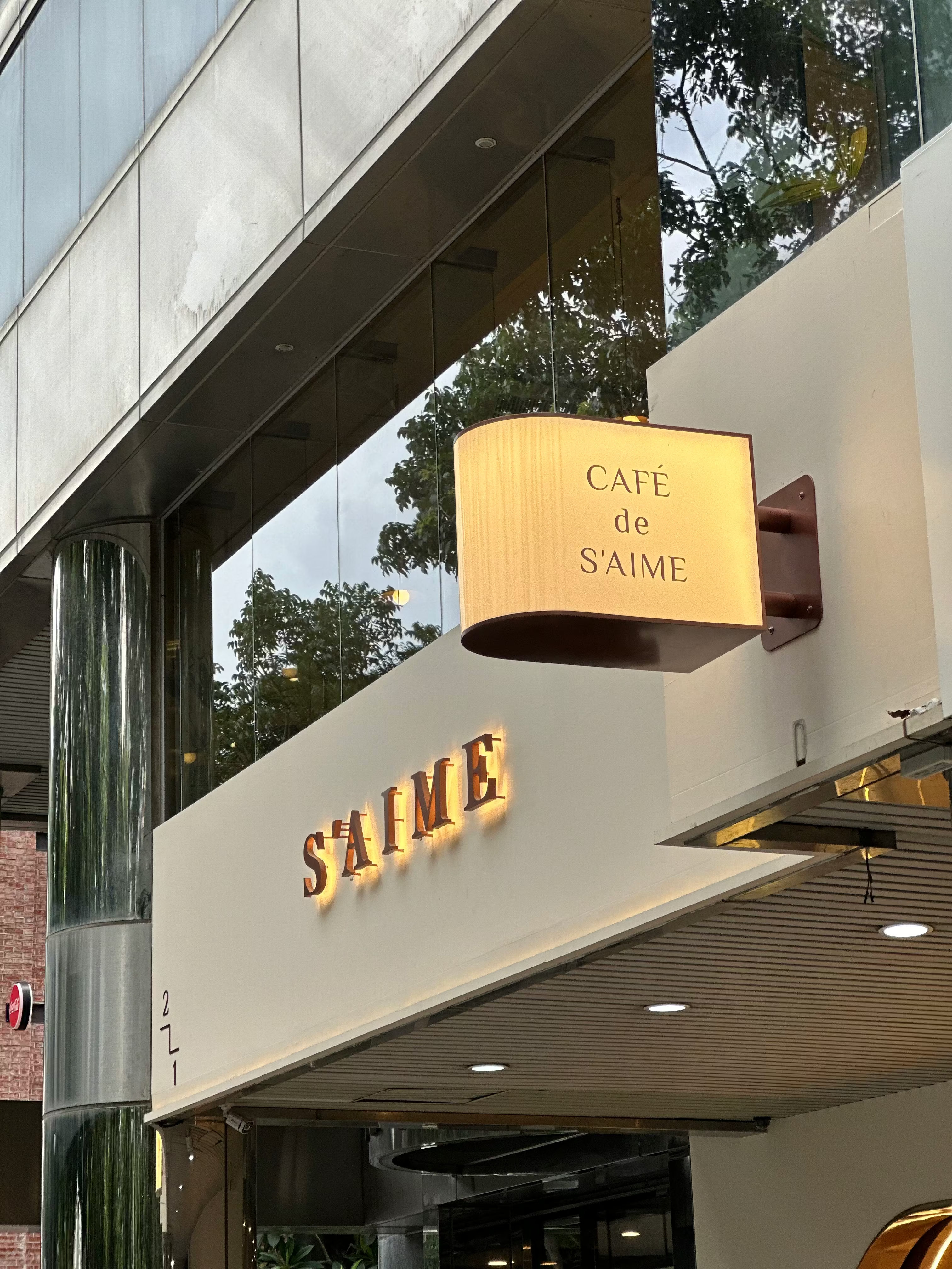
S’AIME Tokyo Kikaku Select Shop Signage | Titanium-Plated Metal Letters & Curved Light Box Case
Selected Works
Floating Metal Letters × Light Box Design
CHYIHAUR crafted the exterior illuminated signage and indoor advertising pieces for S’AIME Tokyo Kikaku, a lifestyle select shop in the Qinmei district: formed stainless-steel, titanium-plated backlit metal letters paired with a semi-circular curved light box, in a dual back-lit and front-lit configuration that echoes the apricot palette of the interior by Ruler Design. Completed in 12 days, with a one-year warranty on the fabricated pieces.
Year
2022
S’AIME Tokyo Kikaku is a lifestyle select shop in the Qinmei district: on the ground floor you can touch the materials, try on the bags you love, and order a coffee with a French pastry; upstairs, a whole row of window seats faces the front-row greenery of the Calligraphy Greenway. Ruler Design built the space on an apricot base, and CHYIHAUR used titanium-plated metal letters and a sculpted light box to fold signage craft into that comfortable palette — clear as wayfinding, yet never stealing the scene.
Floating metal letters, catching the light of the Calligraphy Greenway
01
Project Background & Challenge
S’AIME Tokyo Kikaku opened in the Qinmei district as a lifestyle select shop. Ruler Design built the interior on an apricot base that sets off the rich colours of the merchandise, weaving in metal structures in closely matched tones. CHYIHAUR took charge of the exterior illuminated signage and the indoor advertising pieces: the identity had to sit in harmony with the interior palette while staying clearly legible as wayfinding, both from the street and inside the store — the core of the design integration for this project.
Depth that holds in daylight
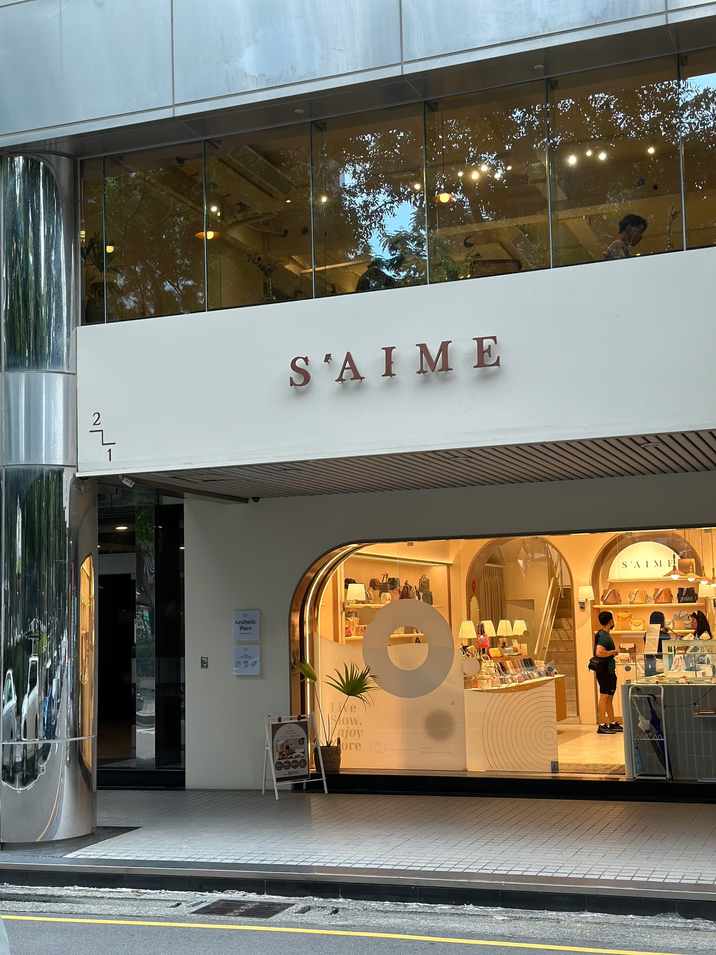
The floating-pin mounting holds the letters clear of the wall, leaving the gap the backlight needs to bloom. By day, with the light off, that same gap casts the shadow that takes over the depth. The letters are formed in stainless steel and then titanium-plated, a tone kept deliberately close to the beige of the interior, so the sign reads from the street without falling back on a contrasting colour — exterior and interior were set out together, in step with the fit-out.
02
Design Goals & Strategy
The main exterior identity uses formed stainless-steel, titanium-plated backlit metal letters, installed with a stand-off method so light halos out from behind each letter to create a floating, three-dimensional effect; the indoor advertising piece takes the form of a semi-circular curved light box, front-lit so the wayfinding reads clearly. The tone of the titanium plating sits close to the apricot palette of the space, letting the signage merge with the interior finish — a comfortable overall palette with clear wayfinding.
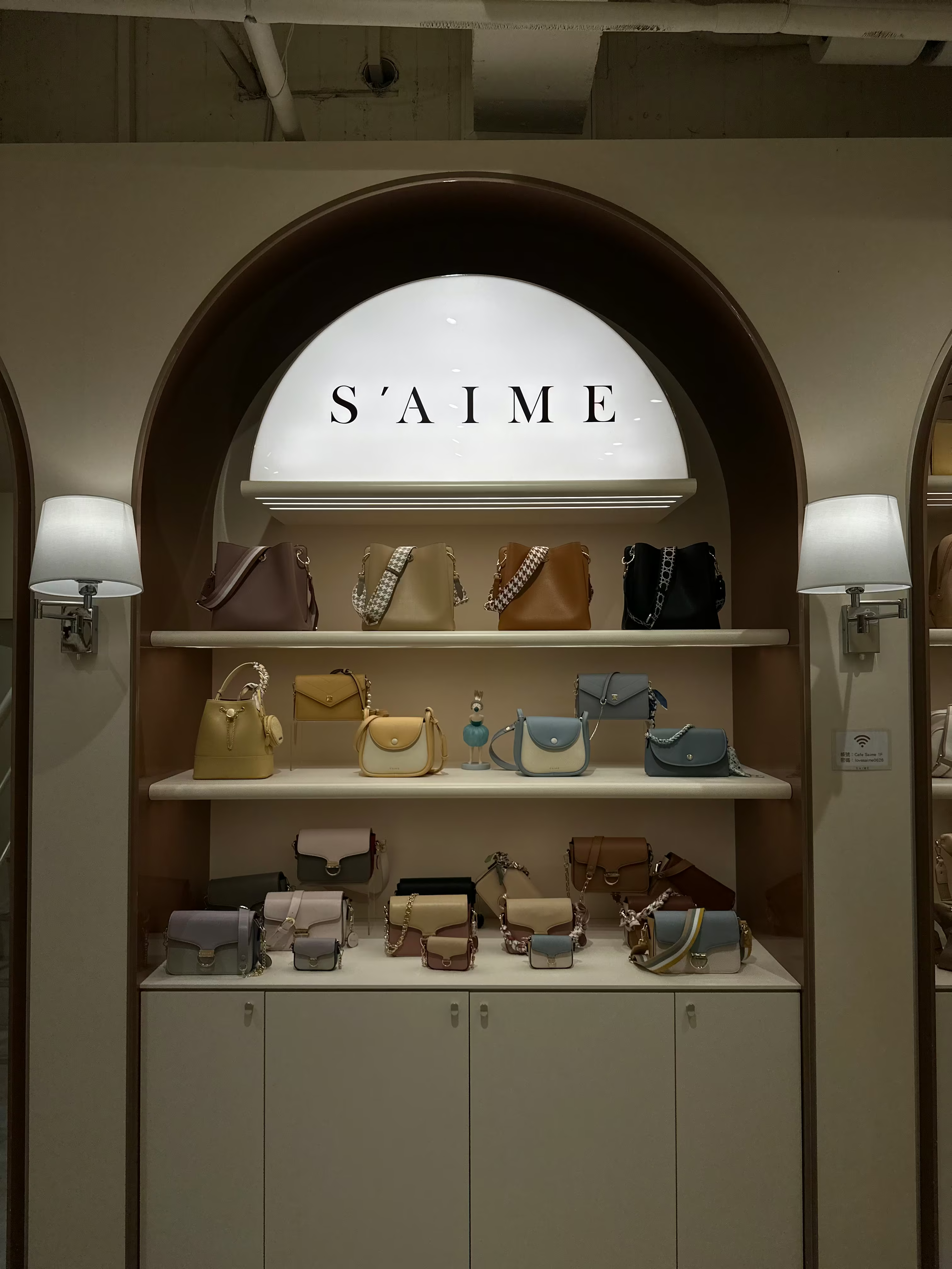
The site set the shape
The lightbox is a half-round, finished off along the arch at the top of the niche; that way it reads as part of the niche itself rather than a panel hung on afterwards. Front lighting keeps the whole face evenly lit, so the wayfinding stays easy to read.
- 01Exterior illuminated signageFormed stainless-steel, titanium-plated backlit letters with a floating stand-off effect.
- 02Indoor advertising pieceDesign and fabrication of the semi-circular curved light box.
- 03Metal fabrication & surface finishingStainless-steel forming and titanium plating for a refined metallic finish.
- 04On-site installationInstalled in step with the interior fit-out, positioning the exterior and indoor pieces in sync.
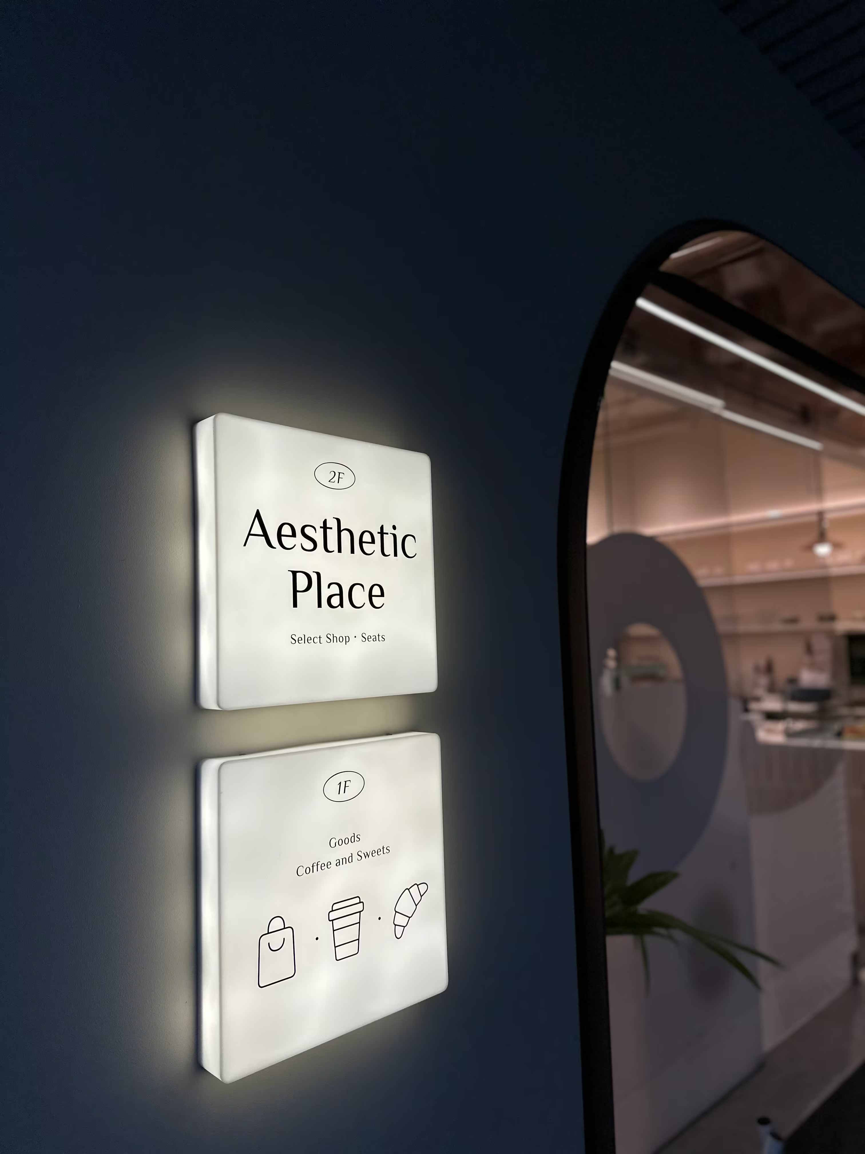
What the numbers leave out
The panels carry only 2F and 1F plus three line icons — a shopping bag, a coffee cup, a croissant: the numbers give the floor, the icons say what is up there.
- 01Main materialsTitanium-plated backlit metal letters plus a curved light box.
- 02Letter fabricationFormed stainless-steel, titanium-plated letters with stand-off backlit mounting.
- 03Light box fabricationSemi-circular curved light box, front-lit configuration.
- 04Lighting configurationDual back-lit and front-lit setup, matched to the exterior and interior needs.
- 05Timeline & warranty12-day build; one-year warranty on the fabricated pieces.
03
Project Outcome
In the finished S’AIME Tokyo Kikaku, the façade’s stand-off letters float free at night as the backlight lifts the brand wordmark evenly off the wall, while the indoor semi-circular light box keeps the circulation wayfinding clear and legible. The titanium plating and the apricot interior answer one another, with 100% fidelity to the design intent. Signage craft and interior design become one, so everyone who walks in feels a consistent brand quality from the entrance all the way up to the second floor.
Learn More
FAQ
This is a CHYIHAUR case for S’AIME Tokyo Kikaku, a lifestyle select shop in the Qinmei district, covering the exterior illuminated signage and indoor advertising pieces — a brand-aesthetic project. The exterior uses formed stainless-steel, titanium-plated backlit metal letters, the interior a semi-circular curved light box, completed in 12 days.
S’AIME’s exterior lettering consists of backlit metal letters formed from stainless steel and then titanium-plated, mounted on precision stand-off supports so light passes out from behind each letter. The halo the backlight casts on the wall lifts the letters into a floating, three-dimensional effect that stays striking at night.
The indoor advertising piece is a semi-circular curved light box, designed and fabricated by CHYIHAUR, front-lit so the wayfinding reads clearly. The curved form softens the light box’s presence, keeping it in tune with the atmosphere of the select shop.
Ruler Design built the space on an apricot base with metal structures in closely matched tones, and CHYIHAUR chose titanium plating of a similar hue to render the brand wordmark and wayfinding. Signage and interior palette stay consistent — comfortable overall, clear in wayfinding — letting the merchandise colours take the lead instead.
The S’AIME Tokyo Kikaku signage project ran to a 12-day build with 100% fidelity to the design, and comes with a one-year warranty on the fabricated pieces after completion.
If you’re planning exterior signage or indoor advertising pieces for a select shop or café-lifestyle space, get in touch with CHYIHAUR via “Contact Us” on the official website, and the team will provide planning advice and a quote based on your space.
Other Cases
Other Cases
These projects may not headline our portfolio, yet each reflects the same commitment CHYIHAUR brings to brand and space.
Whatever the scale, every piece is held to the same standard — so each sign, each installation, becomes a definitive mark the brand leaves on the city.