Lihui CaféInterior Signage & Spatial Identity Case Study
Selected Works
Step inside, and the brand's flavour is only just beginning
CHYIHAUR delivered the interior signage and spatial identity for Lihui Café, weaving the brand's visual language into the room's atmosphere. From identity planning and fabrication to installation, everything was handled end to end, so every place a guest's eyes land—from taking a seat to picking up their order—carries one consistent brand feel.
Year
2023
Project Planning & Execution
CHYIHAUR Team
A café sells more than coffee—it sells the atmosphere of the whole space, and interior signage and identity are the parts of that atmosphere most often seen and most often photographed. Lihui Café commissioned CHYIHAUR to execute its interior signage, letting the brand's visual identity settle naturally into every corner of the room.
01
Background & Challenge
The interior of Lihui Café is where guests linger longest, so the interior signage couldn't simply hang up the shop name—it had to blend into the room's atmosphere. Too bold, and it would break the café's relaxed tone; too understated, and the brand would lose its hook. Calibrating that presence so the signage becomes part of the spatial mood—even a corner guests are happy to photograph and share—was the challenge of this project.
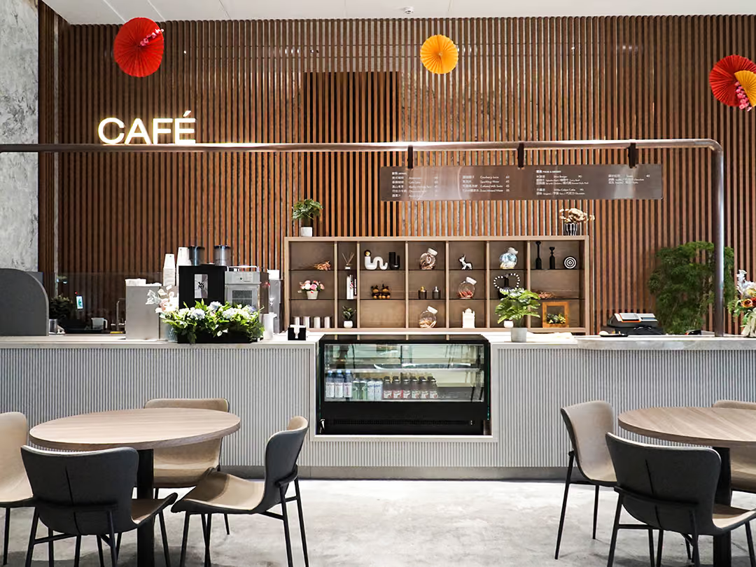
Blending In Without Disappearing
The sign's position was worked backwards from how people move through the shop: the wall behind the counter is where the eye lands while ordering, waiting and settling into a seat, so the brand stays in frame for the whole visit. Its scale was deliberately held level with the shelving and the menu boards — one step larger would override the café's relaxed mood, one step smaller would forfeit the memory point.
02
Design Goals & Strategy
We worked to a principle of "blend in without disappearing": interior signage was positioned along the room's traffic flow and sight lines, so guests encounter the brand's visuals naturally as they sit, order, and collect their drinks. The style and scale of the identity were matched to the room's mood, keeping the café's comfortable tone while holding a clear brand hook.
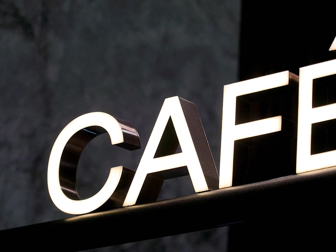
Brightness That Doesn't Take Over
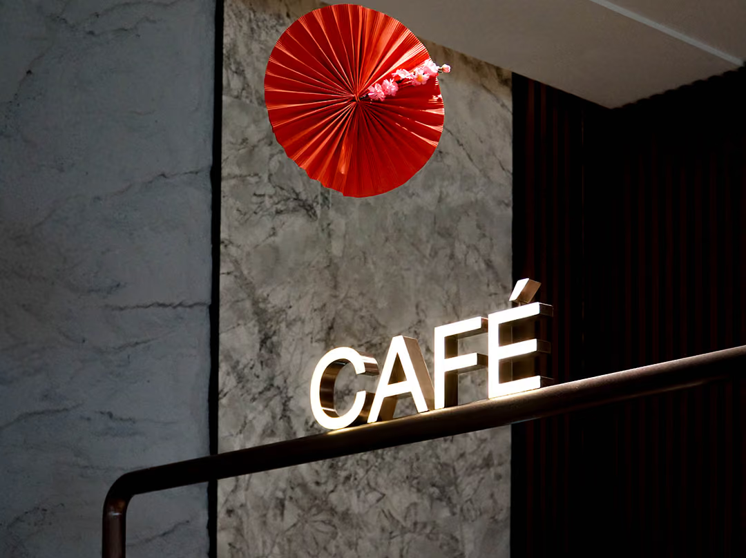
The illuminated face was set to a warm off-white, bright enough only for the letters to be read on their own, so it never becomes the one glaring light source in a dimly lit room. The returns are finished in a dark mirror surface, holding the letterform by reflected ambient light when the sign is off — the identity reads whether the lights are on or not.
- 01Interior Signage PlanningLaid out the interior signage according to traffic flow and sight lines.
- 02Identity FabricationFabricated the interior signage and identity pieces to the design drawings.
- 03On-site InstallationCompleted installation and finishing in step with the fit-out and operating schedule.

The Corner Guests Photograph
The fit-out had not fully cleared and the operating schedule was already set, so the installation could only slot into the window between the two and be finished there — by the time the doors opened, the sign had to be in place.
03
Outcome
Once completed, Lihui Café's interior signage sits in natural harmony with the spatial atmosphere, with the brand's visuals landing exactly where guests linger and take photos—becoming part of the room's memorable character. The interior identity keeps the brand in view for the whole time a guest stays, and makes the space feel more complete and more distinctive.
Learn More
FAQ
This is an interior signage and spatial identity project that CHYIHAUR carried out for Lihui Café. The project planned the identity layout around the room's traffic flow and sight lines, and was executed in full—from design and fabrication to installation.
In the Lihui Café project, CHYIHAUR's principle was "blend in without disappearing": the interior signage had to sit with the room's atmosphere and not disturb its relaxed tone, while keeping a clear brand hook right where guests' eyes land. Getting the placement and scale right matters more than how much decoration you add.
Across food-and-beverage projects such as Lihui Café, CHYIHAUR has observed that interior identity keeps the brand in view for the whole time a guest stays, and becomes a natural backdrop for photos worth sharing. For cafés that care about atmosphere, interior signage is a key part of both the spatial finish and brand recall.
If you're planning interior signage and identity for a café or hospitality space, Lihui Café makes a practical reference case. Feel free to reach CHYIHAUR through the "Contact Us" page on our official website—the team will offer planning advice and a quote based on your space.
At Lihui Café, CHYIHAUR started with interior advertising planning, fixing the signage positions according to the room's traffic flow and sight lines. The interior signage and identity pieces were then fabricated to the design drawings, so that their style and scale matched the actual space. On-site installation was carried out in step with the fit-out and the operating schedule, running from positioning through to the final finishing, so the identity was completed together with the space.
Other Cases
Other Cases
These projects may not headline our portfolio, yet each reflects the same commitment CHYIHAUR brings to brand and space.
Whatever the scale, every piece is held to the same standard — so each sign, each installation, becomes a definitive mark the brand leaves on the city.