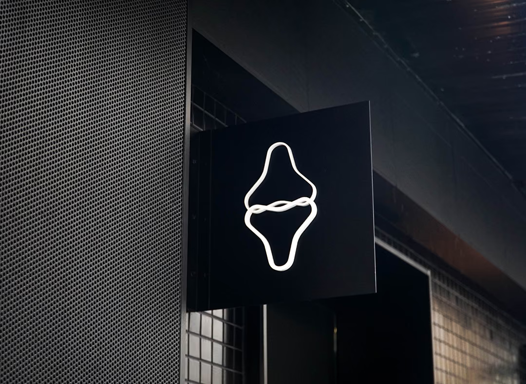
Boshi Physical Therapy Clinic Signage Project | Painted Acrylic Illuminated Letters & Interior Dimensional Lettering Case Study
Selected Works
Let professionalism be seen, starting with the first glance at your storefront
CHYIHAUR designed exterior illuminated signage and interior dimensional lettering for Boshi Physical Therapy Clinic. The facade features front-lit painted acrylic illuminated letters, while the interior continues the identity with non-illuminated painted acrylic letters. Completed in 12 days with 100% design fidelity and a one-year warranty on all fabricated pieces.
Year
2024
Project Planning & Execution
CHYIHAUR Team
For a medical space, signage is more than a name — it is the first impression of professionalism and trust. Boshi Physical Therapy Clinic wanted a storefront that was clear and easy to recognize, with an interior identity that carried the same quality. CHYIHAUR used painted acrylic as the shared material language: front-lit illuminated letters on the facade ensure day-and-night legibility, while non-illuminated dimensional letters indoors keep a calm, composed tone — letting the visual identity flow seamlessly from outside to in.
01
Project Background & Challenge
Boshi Physical Therapy Clinic's identity needs split into two scenarios, inside and out: the exterior sign had to convey the clinic's location and professional image clearly from the street while staying legible at night; the interior identity had to blend with the atmosphere of the treatment space, never too bright or jarring. The core challenge of this project was to satisfy both "eye-catching" and "composed" using a single language of material and color.
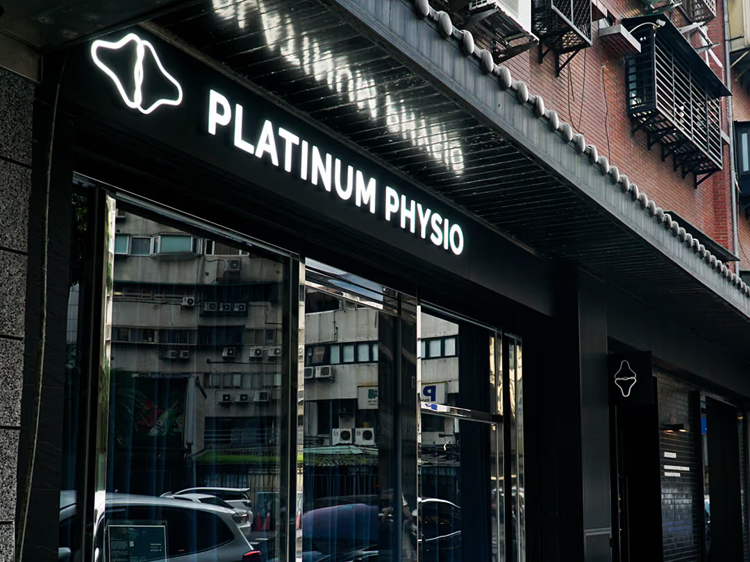
Readable from the street
A clinic has to be found before its image can matter. The exterior therefore uses baked-paint acrylic illuminated letters in a front-lit build, so the faces glow on their own: by day the saturated baked-paint colour carries them, and at night they stay clearly legible. The full-height glass reflects the buildings and parked cars opposite all day long, and a sign lit only from outside would be washed out there — letters that light their own faces are the answer for this position.
02
Design Goals & Strategy
We made painted acrylic the material thread running through both interior and exterior: the facade uses painted acrylic illuminated letters in a front-lit configuration, so the letter faces glow directly — showing saturated painted color by day and staying clearly legible at night. Indoors, the same lettering appears as non-illuminated painted acrylic — the same typeface and palette with a different lighting strategy — so visitors sense a consistent brand quality from the doorway through to the interior.
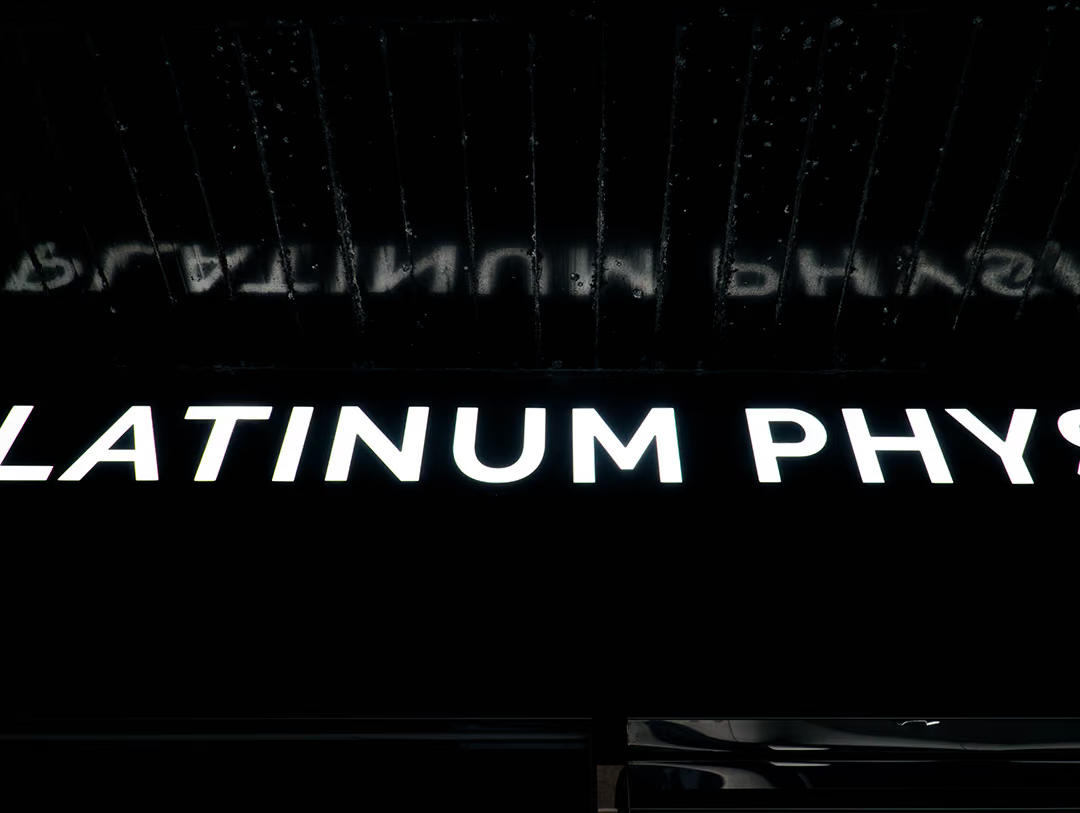
The bar for a single letter
At this distance every flaw is magnified: the face glows evenly with no bright spots, the edges are crisp with no burrs. A front-lit letter's finish is judged up close — from far away you only read the outline; every letter has to match before the whole sign counts as finished.
- 01Exterior Illuminated LettersDesign and fabrication of painted acrylic illuminated letters in a front-lit configuration.
- 02Interior Dimensional LettersNon-illuminated painted acrylic letters that carry the exterior identity indoors.
- 03Painted Surface FinishingSpray-painted acrylic lettering for saturated, consistent color.
- 04On-Site InstallationPositioned installation of the interior and exterior identity for a unified finished quality.

Turning the light off indoors
Indoors it is the light source that changes, not the vocabulary: the same baked-paint acrylic letters drop the illumination and take their depth from cast shadow instead, so they never compete with the treatment space for brightness.
- 01Primary MaterialAcrylic lettering with a painted surface finish.
- 02Lighting ConfigurationFront-lit illuminated letters outside; non-illuminated dimensional letters inside.
- 03Lettering TechniquePainted acrylic illuminated letters / painted acrylic letters.
- 04Timeline & Warranty12-day build cycle; one-year warranty on fabricated pieces.
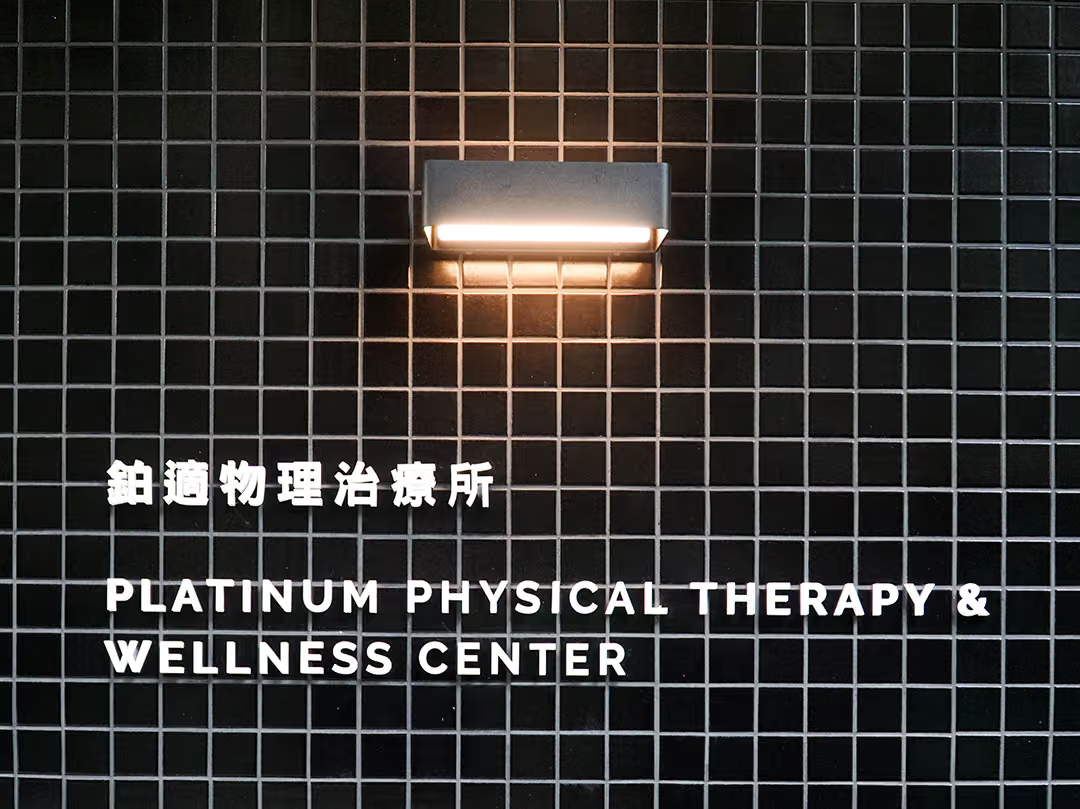
The lamp that stays out of it
The wall lamp's warm glow falls only around the fixture, never onto the letters; these letters do not light up, and they read on the brightness gap between white lettering and black tile.
03
Project Outcome
On completion, Boshi Physical Therapy Clinic's exterior illuminated letters hold clear legibility both day and night, while the interior dimensional letters blend naturally with the tone of the space. Inside and out, the identity is tied together by a single language of material and color, achieving 100% design fidelity. The 12-day build let the clinic present a complete storefront on schedule — and set a clear benchmark for medical-space identity.
Learn More
FAQ
This is a signage and identity project that CHYIHAUR (淇豪廣告) delivered for Boshi Physical Therapy Clinic, covering exterior illuminated signage letters and interior dimensional letters. The facade uses painted acrylic illuminated letters with front-lit illumination, while the interior continues the identity with non-illuminated painted acrylic letters — completed in 12 days.
The exterior sign uses painted acrylic illuminated letters in a front-lit configuration, so the letter faces glow directly, showing saturated painted color by day and staying clearly legible at night.
The interior identity is rendered in non-illuminated painted acrylic letters so it blends with the calm atmosphere of the treatment space rather than competing for attention through brightness. The same typeface and palette paired with a different lighting strategy keep the visual identity consistent inside and out, each suited to its setting.
Signage for a medical space has to convey both professionalism and trust: the exterior needs clear day-and-night legibility, while the interior identity must harmonize with the atmosphere of the space. CHYIHAUR recommends carrying a consistent language of material and color through both, so visitors sense a coherent brand impression from the door to the treatment room.
The Boshi Physical Therapy Clinic signage project had a 12-day build cycle and achieved 100% design fidelity; all fabricated pieces come with a one-year warranty.
If you are planning signage and identity for a clinic, therapy practice, or medical space, get in touch with CHYIHAUR (淇豪廣告) via the "Contact Us" page on our official website, and the team will provide planning advice and a quote based on your space.
Other Cases
Other Cases
These projects may not headline our portfolio, yet each reflects the same commitment CHYIHAUR brings to brand and space.
Whatever the scale, every piece is held to the same standard — so each sign, each installation, becomes a definitive mark the brand leaves on the city.