
Mercedes-Benz Taiwan Indoor Signage Project | Automotive Brand Spatial Identity Case Study
Selected Works
Precision craft, answering the standard of a century-old marque
CHYIHAUR delivered the indoor signage and identity engineering for Mercedes-Benz Taiwan, meeting the exacting standards of a global automotive marque with rigorous fabrication and installation quality. The brand identity is rendered precisely within the interior space, holding a consistent, refined presence that withstands close inspection.
Year
2021
Project Planning & Execution
CHYIHAUR Team
Executing identity work for a global automotive brand tests not creativity but precision. On Mercedes-Benz Taiwan's indoor signage, every letter spacing and every finished surface answers to visual standards the brand has built over decades, leaving almost no margin for error. CHYIHAUR took on this project with disciplined fabrication and installation, presenting the brand identity in the space exactly as it should appear.
01
Project Background & Challenge
The indoor identity engineering for Mercedes-Benz Taiwan faced the consistent high standards of a global automotive brand: the presentation of the logo and typeface follows clear specifications, while the interior setting exposes the identity to close-range scrutiny, leaving no fabrication flaw or installation deviation anywhere to hide. The core challenge of this project was to carry "precision" all the way from the drawing to the finished surface.

Level and spacing on a striped wall
The wall itself is a run of black-and-white vertical stripes, and the dark ceiling grille at the top left follows the same set of parallel lines. Let a letter drift a little off level, or the spacing open up, and those lines work as a scale that enlarges the error into something anyone can see. Level and spacing were therefore set to the specified values before the letters went up. The faces are not illuminated; the letters are presented only through the white panel and the dark grey folded sides.
02
Design Goals & Strategy
We took faithful reproduction of the brand guidelines as our first principle: fabrication was executed in strict accordance with the identity specifications, while installation was precisely positioned with controlled level and spacing, ensuring every point of the identity matched the standard exactly. The CHYIHAUR team carried out this project with the construction discipline it brings to serving global brands, so the finished quality withstands scrutiny from both the brand and its visitors.
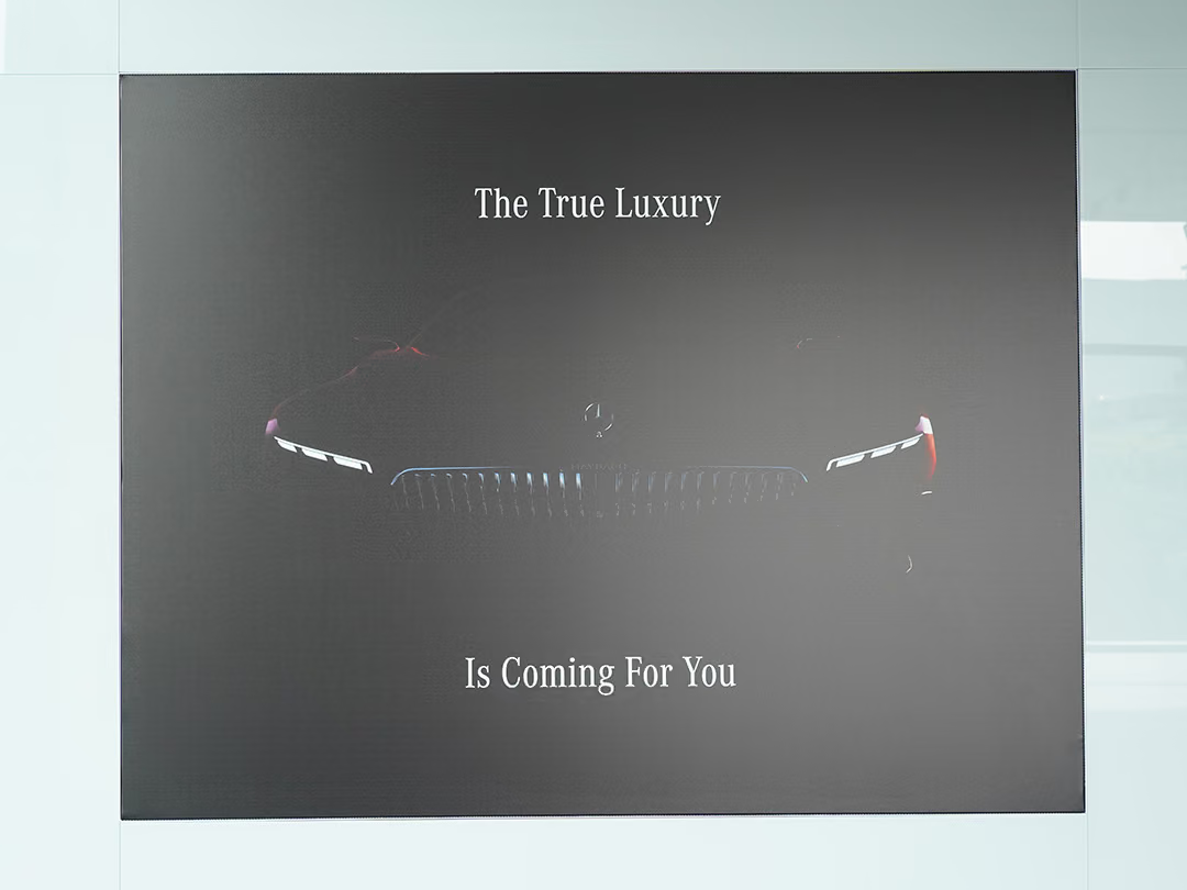
A low-contrast narrative panel
This panel is not there to tell you where you are; it carries the brand message, so the contrast is deliberately held low — the star and the front grille only surface once you come close. The wording follows the same brand type specification as the lettering, so the space never ends up with two typefaces.
- 01Indoor signage fabricationFabricated to the brand identity guidelines, with strict control over finished-surface quality.
- 02On-site installationPrecisely positioned installation, controlling level, spacing and detailed edge finishing.
- 03Quality inspectionVerified item by item against the identity guidelines to ensure a consistent presentation.

Consistency starts one letter at a time
Interior signage that holds up at close range depends on every letter carrying the same thickness and the same folded edge, and that can only be controlled letter by letter in fabrication.
03
Project Outcome
Upon completion, the indoor identity precisely conveys Mercedes-Benz Taiwan's brand standard, with the logo and typeface holding a consistent, refined quality throughout the space that withstands inspection both up close and from afar. This project also built on CHYIHAUR's experience of serving global automotive brands, getting every detail right within identity engineering held to rigorous standards.
Learn More
FAQ
This is a case study of the indoor signage and identity engineering CHYIHAUR carried out for Mercedes-Benz Taiwan in 2021. The project took faithful reproduction of the global automotive brand's identity guidelines as its principle, controlling quality strictly from fabrication through to installation.
The services CHYIHAUR provided for Mercedes-Benz Taiwan included indoor signage fabrication, on-site installation and quality inspection, all executed in accordance with the brand identity guidelines throughout.
Identity engineering for a global brand puts faithful reproduction of the guidelines first: the logo, typeface, proportions and finished surfaces all follow clear standards, and the contractor must be able to translate those guidelines precisely into the actual site. In the Mercedes-Benz Taiwan project, CHYIHAUR met that high standard with disciplined fabrication and installation.
Indoor signage is viewed at close range, so any fabrication flaw, crooked installation or rough edge finishing is seen directly. Indoor identity therefore demands even stricter finished-surface quality than outdoor work, requiring precise positioning and detail control — exactly where CHYIHAUR's execution excels.
If your brand is planning indoor identity engineering for a showroom or commercial space, you are welcome to reach out to CHYIHAUR through the "Contact Us" page on our official website. Our team will provide planning advice and a quotation based on your brand guidelines and site conditions.
Other Cases
Other Cases
These projects may not headline our portfolio, yet each reflects the same commitment CHYIHAUR brings to brand and space.
Whatever the scale, every piece is held to the same standard — so each sign, each installation, becomes a definitive mark the brand leaves on the city.