Jipu Construction Facade Lettering | Raised Standoff Letters on a Corporate Building
Selected Works
Building facade × integrated brand aesthetics
CHYIHAUR produced the rooftop facade lettering for Jipu Construction’s corporate building, using a raised standoff structure that holds the letters away from the wall to cast a shadow. The surface uses a fine baked finish to keep the colour stable over the long term, and the letter proportions follow the building’s own louvre divisions so the sign reads as part of the facade rather than an attachment.
Year
2020
When a developer puts its name on a building it built itself, the sign is already a demonstration of its construction standards. This rooftop lettering for Jipu Construction is read from the street and from across the river alike: too thin and it blurs at distance, too heavy and it overwhelms the facade. CHYIHAUR’s approach was to make the letters part of the facade, buying legibility with structure and shadow rather than sheer size.
A name on a facade should be built as carefully as the building
01
Background and challenges
Jipu Construction needed lettering on the top floor of a new development that could represent the company for the long term. Building signage is not storefront signage: it sits more than ten storeys up and is read from the street as well as from across the river. Letters that are too thin blur at distance; letters that are too heavy overwhelm the proportions of the facade itself. This development sits on the edge of town between mountains and river, so the lettering had to work for both the open long view and the close architectural detail.
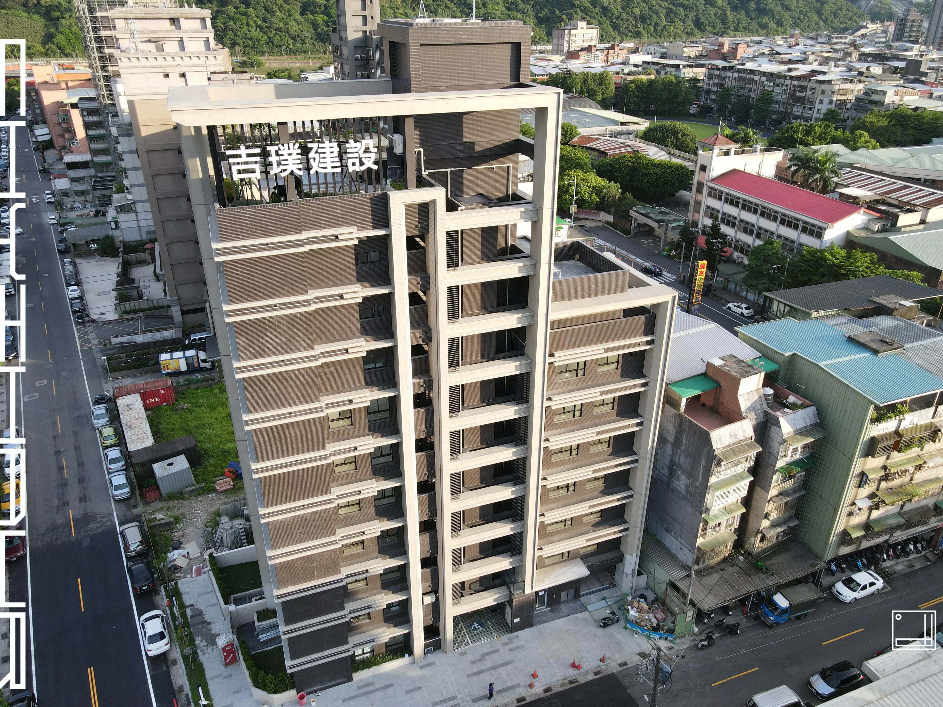
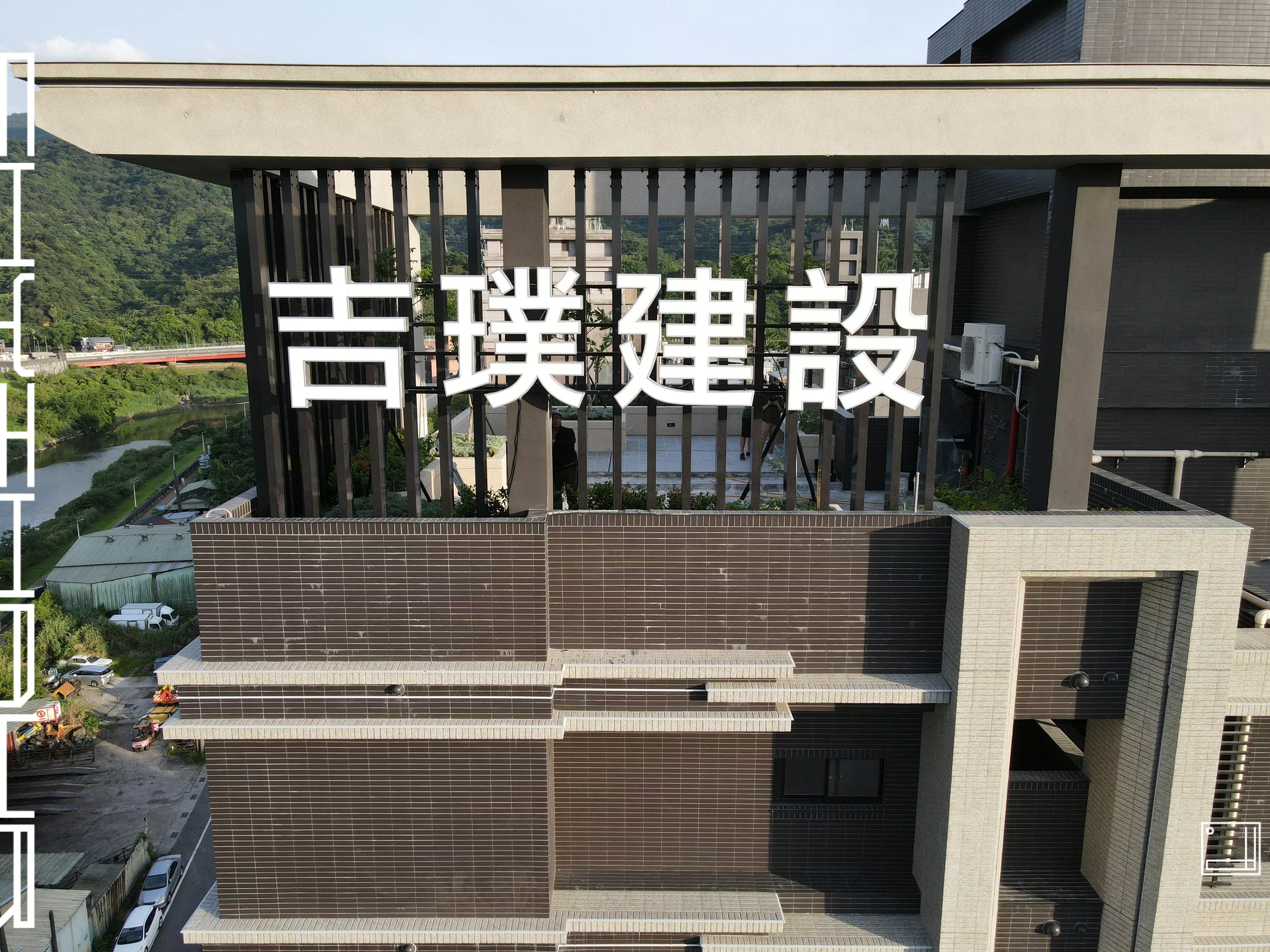
Facade in full view
An aerial view of the development facade, where the white Jipu Construction lettering sits inside the recessed frame of the top floor, layered clearly against the dark louvres and pale columns below. The letters were deliberately aligned to the building’s horizontal divisions so the sign reads as part of the facade design rather than something added later.
02
Design goals and strategy
Our goal was to make the letters part of the facade rather than something hung on it. The lettering uses a raised standoff structure that holds the letter bodies away from the back wall, so daylight casts a shadow behind them and the strokes gain depth from any angle. The surface uses a fine baked finish to keep the colour stable over the long term and avoid the fading that high-level sun and rain produce. Letter proportions and placement were set from the building’s own louvre divisions and horizontal lines, so the sign aligns with the facade.
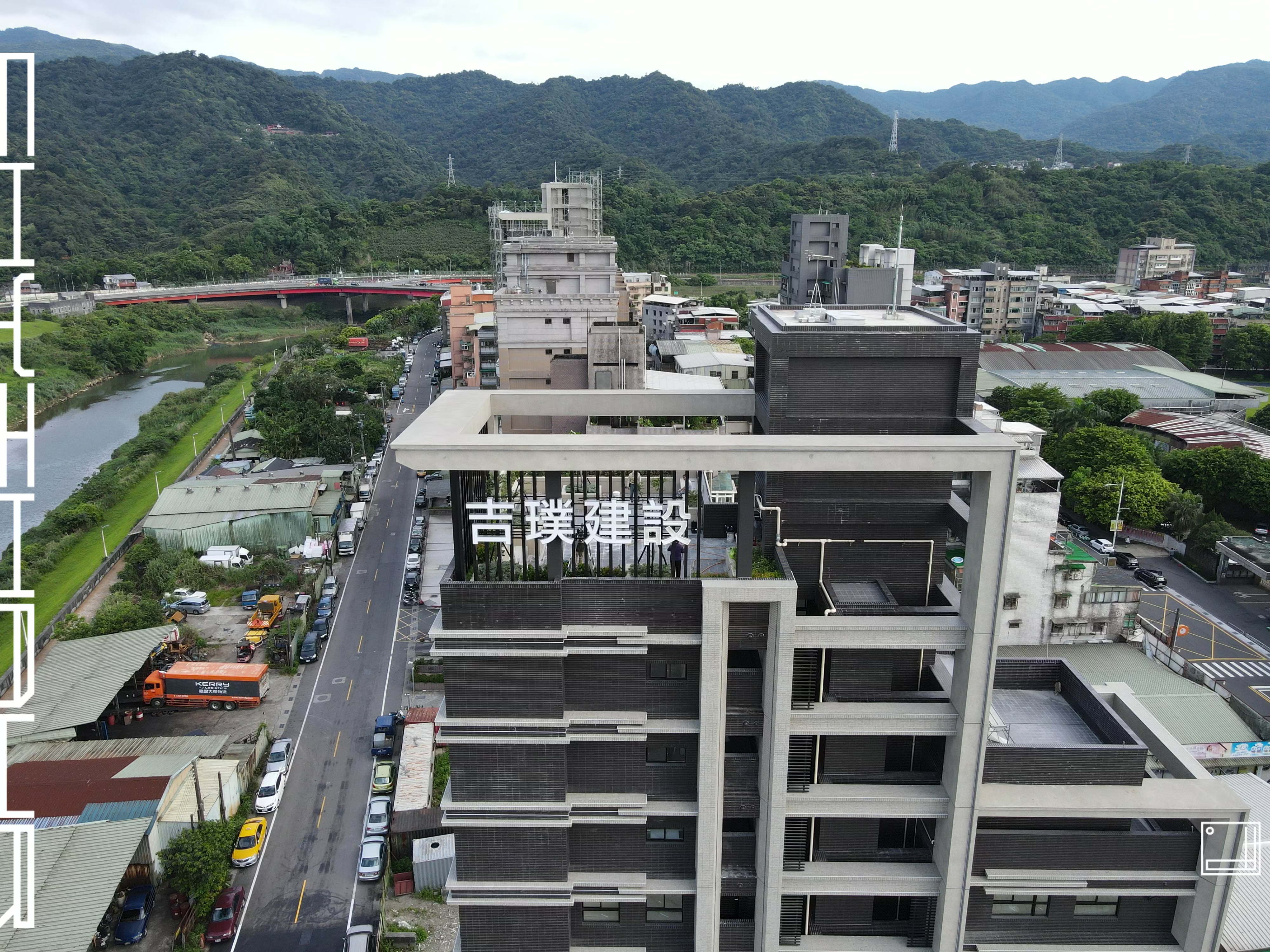
Legibility at distance
Seen from the river, the lettering holds a clear outline between the mountains and the town; the standoff structure separates the letter bodies from the dark back wall so they are not swallowed by the background.
- 01Outdoor signage designOverall visual and proportion planning for corporate building facade lettering.
- 02Sign fabricationFacade lettering produced with letter sizes set by the scale of the elevation.
- 03Letter techniqueRaised standoff structure holding the letters off the wall to cast a shadow.
- 04Surface treatmentFine baked finish to keep the colour stable over the long term.
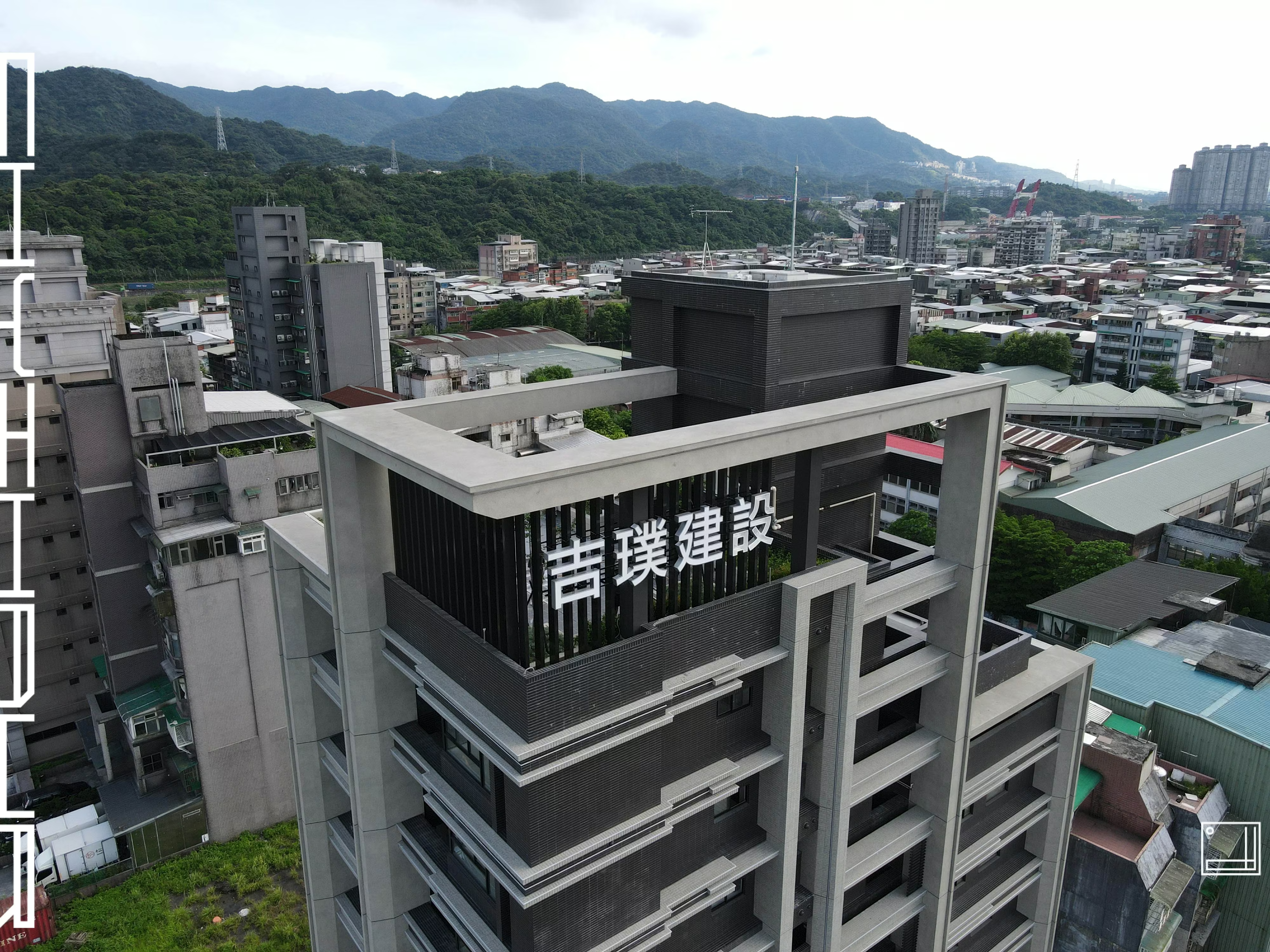
Raised standoff structure
Up close, the gap between the letter bodies and the louvred back wall is visible, and daylight shadow gives the strokes their depth.
03
Project outcome
The completed facade lettering holds its legibility both in the aerial long view and from street level. The shadow created by the standoff structure gives the strokes depth under any light, and the fine baked finish keeps the colour stable in the exposed conditions of an upper floor. For a developer, this lettering is not only an identity — it is a demonstration of its own workmanship, placed on its own frontage.
Learn More
FAQ
This is a corporate building facade lettering project delivered by CHYIHAUR for Jipu Construction, located on the top-floor elevation of a new development. The scope covered visual and proportion planning for the facade lettering, fabrication of the letters, the raised standoff structure and a fine baked surface finish.
Raised standoff letters have supports behind the letter body that hold it a set distance off the wall, instead of sitting flush against it. That gap casts a shadow in daylight, giving the strokes depth from near and far, and keeping the outline from being swallowed by a dark wall surface.
The biggest difference is viewing distance. Storefront signs are mostly read from within tens of metres; facade lettering has to work for both the near street view and a long view hundreds of metres away. So letters that are too thin blur at distance while letters that are too heavy overwhelm the facade — size and stroke weight have to follow the building’s own division lines.
Signage high on a building takes years of sun and rain. If the surface treatment falls short, colour shift or chalking appears within a few years and ends up emphasising the building’s ageing. This project uses a fine baked finish precisely to keep the colour stable, so the sign ages with the building rather than ahead of it.
If you are planning facade lettering for a corporate building or a development, contact CHYIHAUR through the Contact page on our website. The team will advise on planning and pricing based on your facade divisions, viewing distances and surroundings.
Other Cases
Other Cases
These projects may not headline our portfolio, yet each reflects the same commitment CHYIHAUR brings to brand and space.
Whatever the scale, every piece is held to the same standard — so each sign, each installation, becomes a definitive mark the brand leaves on the city.