Daylight (光合箱子) | Outdoor Storefront Signage Design & Fabrication for a Brunch Café
Selected Works
A façade as clean and warm as daylight
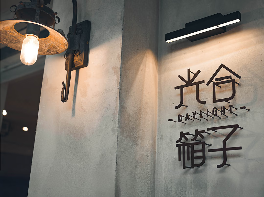
CHYIHAUR designed and fabricated the outdoor storefront signage for the brunch brand Daylight (光合箱子). Built around the brand's fresh, natural character, we crafted a clean, warm façade that unifies the brand image, lifts street-level recognition, and turns the storefront into a corner people want to step into.
Year
2022
Project Design & Execution
CHYIHAUR Team
Daylight is loved for its natural, wholesome brunch, and the brand reads as fresh and warm as sunlight. A storefront's outdoor signage can't simply "hang up the shop name"—it has to carry that character out to the street-facing façade. Starting from the brand identity, CHYIHAUR handled the design, fabrication and installation of the storefront's outdoor signage, so passers-by sense the brand's spirit from a distance.
01
Background & Challenge
Daylight is a brunch brand built on natural, healthy eating, with a visual identity centred on freshness and quality. Signage that overstates itself would clash with that character, yet playing it too quiet risks losing street-level recognition. Striking the balance between a clean look and clear legibility was the core challenge of this project.
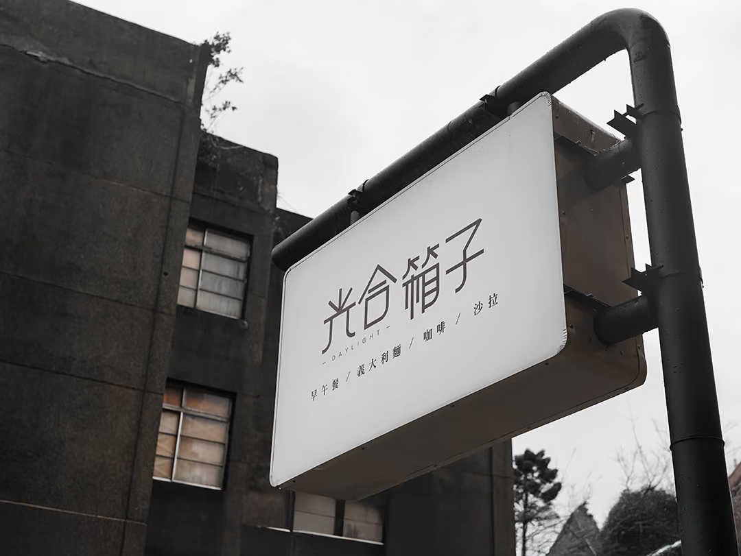
Legibility without scaling up
The brand identity asks for white space and room around the type; street legibility asks for large letters and hard contrast, and the two cancel each other out. So the type was left alone and the layout and position did the work: the white field is kept large enough that the noise of grey concrete buildings and old window frames stays outside the sign, which is what lets the thin lettering hold; and the sign is not fixed flat to the wall but raised on a round tubular post as a double-sided panel, so it reads from both directions along the pavement. Legibility is placed in the area of white space and in where the sign sits.
02
Design Goals & Strategy
Strategically, the brand identity set the baseline: we preserved generous whitespace and let the typography breathe, giving the sign a natural quality consistent with the brand. At the same time, the sign's placement, proportion and fit with the overall façade kept the shop name clearly legible at street-viewing distance. The façade never competes with the brand—it quietly makes the brand's character clear.

Subtraction on the indoor panel
The letters are not applied onto the panel; they are cut out of it. The edge of the cut shows its thickness, and the light comes through that thickness, a warm off-white. Apart from the letters and one small round hole there is nothing else on the panel — not upstaging the brand was the premise of this job.
- 01Signage Visual PlanningPlanning the sign layout and overall façade visuals around the brand identity.
- 02Outdoor Signage FabricationFabricating the storefront's outdoor signage to restore the brand's fresh character.
- 03On-site InstallationPositioning and installing to suit the storefront's façade conditions.
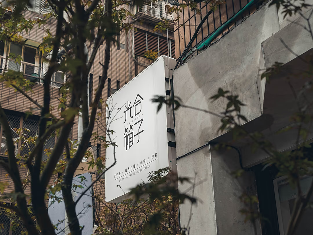
A split between two viewing distances
The projecting sign is for people walking along the street. Shop name and menu items are set at clearly different sizes, so one panel gives the name at a distance and the dishes to whoever comes closer.
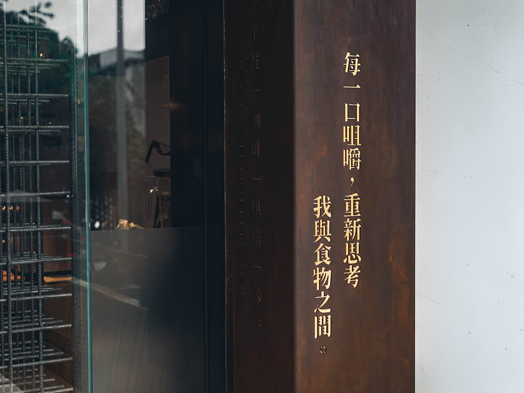
Where the contrast comes from
The gold letters stand proud of the rusted surface, and the contrast is won from that difference in height and the shadow at their lower right — no openings, no added light. What was wanted here is clean, not loud.
03
Project Outcome
With the work complete, Daylight's storefront now reads in full harmony with its brand identity: a clean, warm façade that echoes the brand's impression of sunlight and nature. As street-level recognition rose, the façade itself became an extension of the brand's character, letting customers feel the lifestyle the brand wants to convey before they even step inside.
Learn More
FAQ
This is CHYIHAUR's outdoor storefront signage design and fabrication case for the brunch brand Daylight (光合箱子). The project centred on the brand's fresh, natural character to craft a clean, warm façade and raise street-level recognition.
In the Daylight case, CHYIHAUR delivered end-to-end outdoor signage design, covering signage visual planning, outdoor signage fabrication and on-site installation, integrated with the overall façade presentation.
CHYIHAUR's approach takes the brand identity as the baseline, conveying quality through whitespace, type proportion and the overall façade rather than making things bigger and brighter. The Daylight project kept the brand's fresh character while ensuring the shop name stayed clearly legible at street-viewing distance.
If you're planning signage design and fabrication for a brunch, coffee or other food-and-beverage storefront, get in touch with CHYIHAUR through the "Contact Us" page on our official website. Our team will provide planning advice and a quote based on your brand character and storefront conditions.
CHYIHAUR takes the view that a façade starts speaking to customers before they reach the door. Once Daylight's storefront was finished, its façade echoed the brand's impression of sunlight and nature, becoming an extension of the brand's character that lets customers feel the lifestyle it wants to convey before they step inside.
Other Cases
Other Cases
These projects may not headline our portfolio, yet each reflects the same commitment CHYIHAUR brings to brand and space.
Whatever the scale, every piece is held to the same standard — so each sign, each installation, becomes a definitive mark the brand leaves on the city.