CPD Interiors Indoor & Outdoor Signage Design | Interior Design Studio Brand Identity Case
Selected Works
Never Disrupting the Space, Yet Clearly Present
CHYIHAUR crafted indoor and outdoor signage for interior design studio CPD Interiors, extending the brand's philosophy of exploring structure and perception. The identity is expressed through pure structure and proportion—signage that never disrupts the space yet remains clearly present, becoming the interface between space and people.
Year
2024
Project Planning & Execution
CHYIHAUR Team
CPD Interiors is devoted to exploring the relationship between physical structure and spiritual perception within built environments, deconstructing function and rebuilding narrative from logic, material, and form. Creating signage for a studio like this is a test not of boldness but of restraint—CHYIHAUR treats signage as the interface between space and people, letting the identity exist in its purest form.
01
Project Background & Challenge
CPD Interiors is a design studio with a clear point of view on space: deconstructing function and rebuilding narrative from logic, material, and form. Creating signage for design professionals is the least forgiving of briefs—signage that is too assertive interferes with the spatial experience they pursue, while signage that is too subtle loses its purpose as identity. Finding the precise balance between "presence" and "sense of space" was the core challenge of this project.
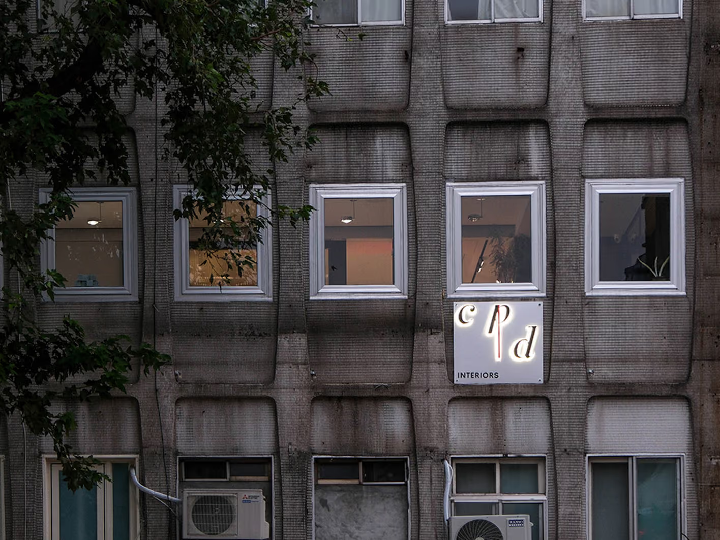
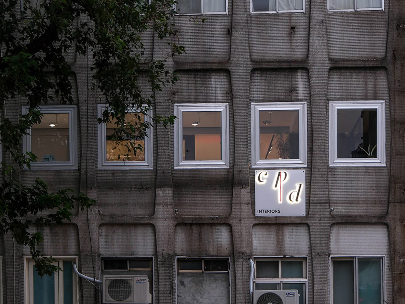
Presence Without Scale
The old wall gave us nothing to build on, and the quickest answer — a bigger, brighter sign — would have contradicted exactly what CPD argues about space. We worked through proportion instead: the lettering, the structure and the way it is mounted are themselves the design. The letters stay small, and a glow spilling from behind them opens up their outline. The red vertical line is the only formal gesture left after the brand idea was translated. The sign still reads in low light without competing with the building.
02
Design Goals & Strategy
We carried forward CPD's philosophy, treating signage as the interface between space and people rather than decoration applied to a building. The design emphasizes pure structure and proportion: stripping away superfluous formal vocabulary so that the typography, construction, and method of installation become the design itself. Indoor and outdoor signage follow a consistent visual logic, allowing the brand identity to extend naturally along the visitor's path until it reaches the depths of the user's perception.
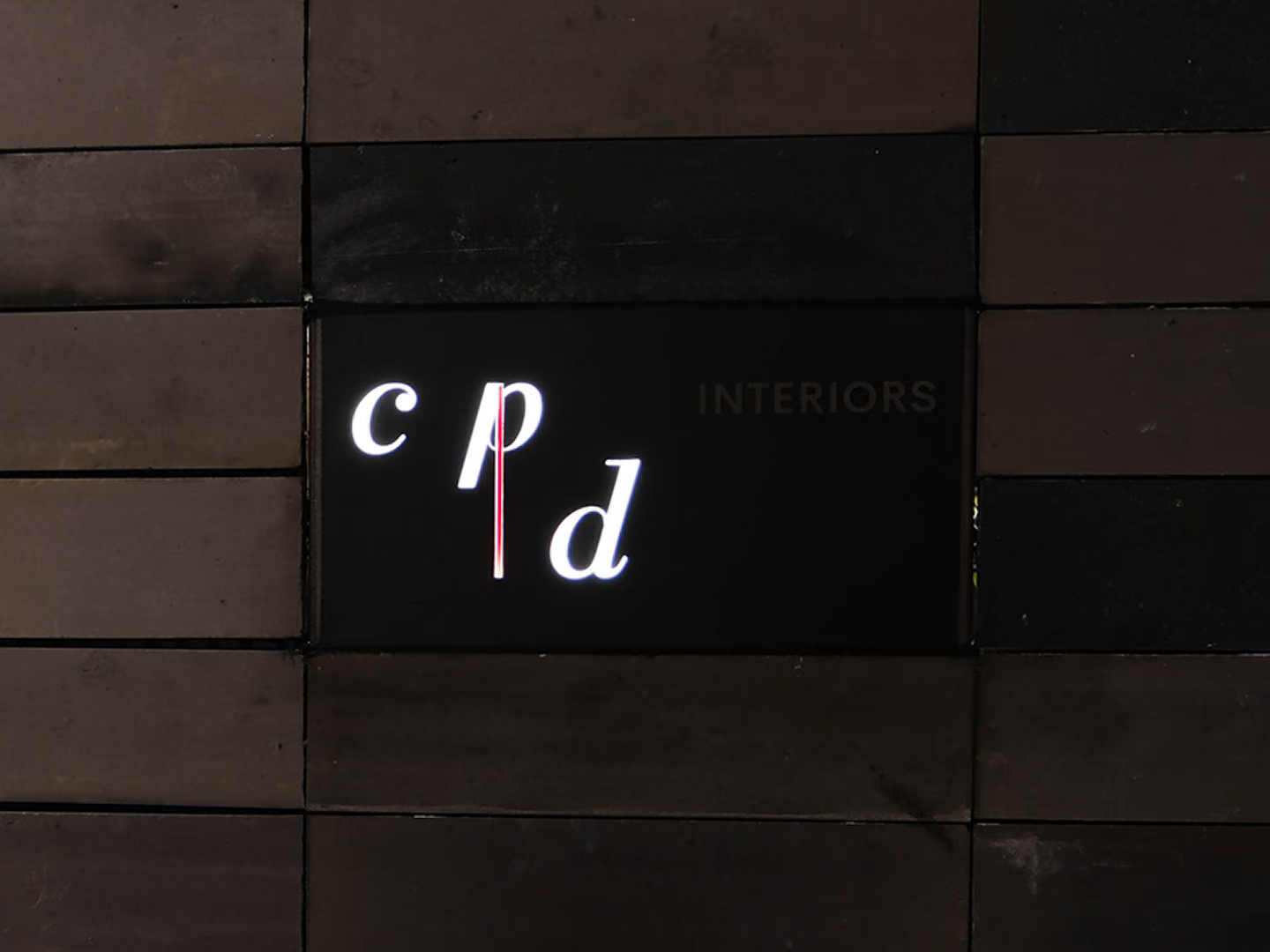
Set Into the Wall, Not Onto It
On a dark wall, any applied frame becomes one form too many. The panel is set into the finished surface instead, positioned precisely on site so the edges close cleanly — the sign belongs to the wall rather than sitting on it. With the light off, only the proportion remains.
- 01Outdoor Signage DesignFacade identity planning integrated with the external spatial experience.
- 02Indoor Signage PlanningInterior identity that continues a consistent visual logic, connecting the visitor's path.
- 03Brand Identity TranslationTranslating the brand's design philosophy into a visual vocabulary of structure and proportion.
- 04On-Site InstallationPrecise positioning and installation aligned with the space's finished surfaces.
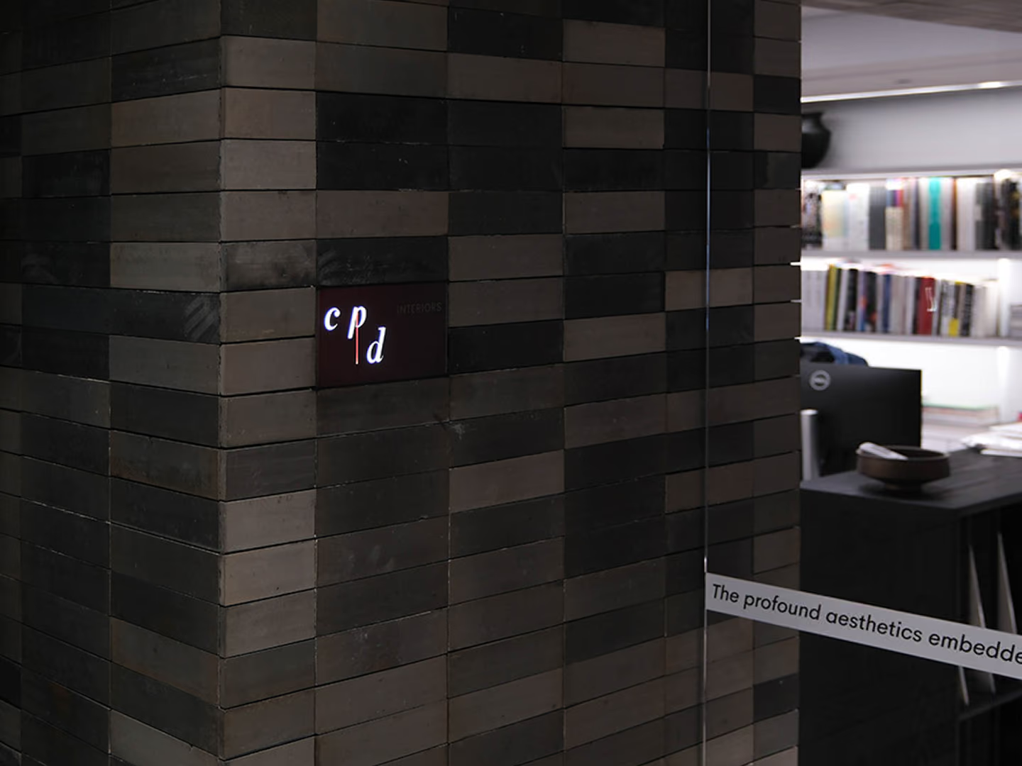
Continuity Along the Route
The smallest piece indoors, yet built on the same structure and proportion, so the brand carries on along the visitor route; the visual lead is left to the book wall and the working floor.
03
Project Outcome
Once complete, the CPD Interiors identity stands quietly within the space through pure structure and proportion: never disturbing the overall atmosphere, yet clearly present the moment the eye comes to rest. Indoor and outdoor signage link into one coherent brand experience, becoming the most direct demonstration of CPD's design philosophy—even their own signage is a work of deconstruction and reconstruction.
Learn More
FAQ
This is a CHYIHAUR case for indoor and outdoor signage created for interior design studio CPD Interiors, translating the brand's philosophy of exploring structure and perception into an identity design of pure structure and proportion. The signage is positioned as the interface between space and people—never disrupting the space, yet clearly present.
CHYIHAUR's experience on the CPD Interiors project is this: for a design studio, signage is not about standing out but about restraint and consistency with the brand's philosophy. The identity must resonate with the brand's own design point of view—here, by removing superfluous form and returning to structure and proportion, the signage itself becomes a demonstration of the brand's philosophy.
CHYIHAUR gave CPD Interiors' indoor and outdoor signage a consistent visual logic, letting the identity extend naturally along the visitor's path. From the first glance outside the building to the moment the gaze settles inside, the typography, construction, and proportion all follow the same vocabulary, keeping the brand experience coherent.
In CHYIHAUR's view, brands that value spatial atmosphere and a professional image—like CPD Interiors: design studios, architecture firms, arts and cultural spaces, or curated lifestyle brands—are especially suited to a pure identity built on structure and proportion. This style lets signage blend into the space rather than overpower it, which in turn brings out the brand's quiet confidence.
If you are planning indoor or outdoor signage for a studio, firm, or commercial space, get in touch with CHYIHAUR through the "Contact Us" page on our official website. Our team will provide planning advice and a quote tailored to the character of your space.
Other Cases
Other Cases
These projects may not headline our portfolio, yet each reflects the same commitment CHYIHAUR brings to brand and space.
Whatever the scale, every piece is held to the same standard — so each sign, each installation, becomes a definitive mark the brand leaves on the city.