Qianyan Enterprise Indoor Signage & Identity Project | Brand Space Image Design Case
Selected Works
The Clearest Brand Mark in a Quiet Space
CHYIHAUR planned and delivered an indoor signage and identity project for Qianyan Enterprise—from identity design and signage fabrication to on-site installation. The brand mark blends naturally with the texture of the space, so visitors sense the corporate image the moment they walk in, forming a consistent and professional first impression.
Year
2024
Project Planning & Execution
CHYIHAUR Team
The impression a company makes often begins the moment you step into its space. Qianyan needed a set of indoor signage that could stand for the brand—an identity that sits quietly yet surely within the space and becomes the first image visitors remember. CHYIHAUR delivered this identity project end to end, from design through installation.
01
Project Background & Challenges
Qianyan's spatial identity brief centered on the "first impression": indoor signage is the first brand signal visitors notice as they enter the space. The challenge was for the signage to render the brand mark faithfully while harmonizing with the material, tone, and light of the space—its size and placement following the visual flow so the identity becomes a natural part of the room.
First Glance, Set by Circulation
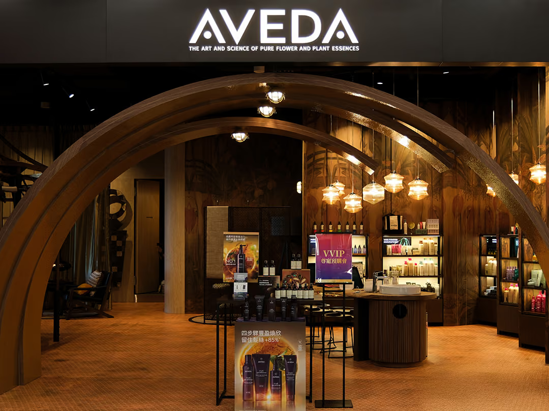
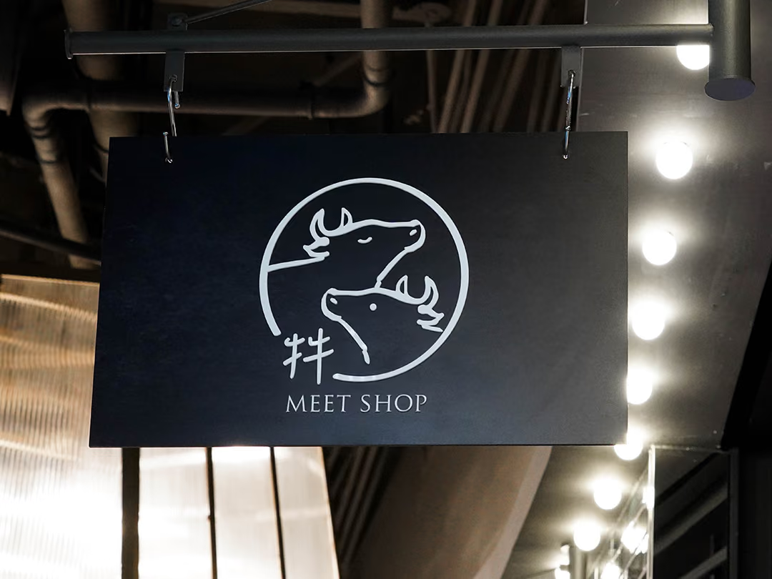
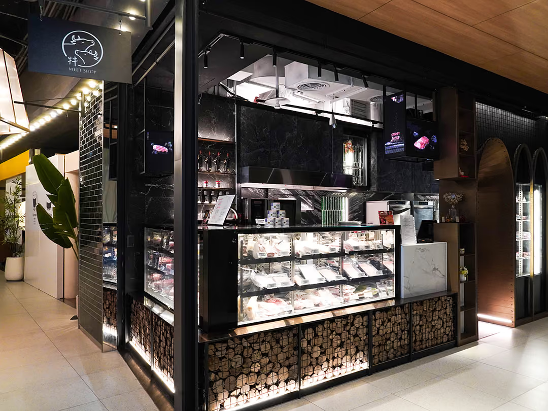
Dark stone and warm display lighting already draw the eye, so a sign that is merely hung would be absorbed by the materials and tones around it. We first traced visitor circulation to find the angle from which this shopfront is seen first, then set the size and mounting position against the wall conditions, so the mark falls naturally into the main sightline. Legibility is carried by the contrast of dark ground against white line work, letting the identity become a natural part of the space.
02
Design Goals & Strategy
We worked on the principle that identity and space should elevate each other: first we set the sign's style and proportions from the brand identity, then planned its size and mounting position around the on-site wall conditions and circulation, letting the mark catch the eye naturally from the primary viewpoints. Design, fabrication, and installation were handled by one continuous team, keeping the finished quality true to the design drawings.
Proportions Held at Full Size
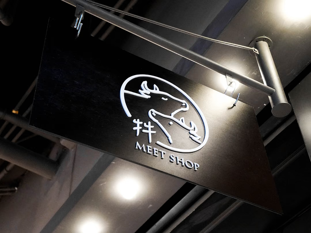
When a mark is enlarged, stroke weight and letter spacing are the first things to drift. Style and proportion here were set directly from the brand identity and produced to the drawings, so the oval frame, the two animal heads and the lettering below keep their original relationships at built size.
- 01Indoor Advertising PlanningPlanning the indoor signage and identity visuals for the corporate space.
- 02Identity DesignDefining sign style, size, and proportion in line with the brand identity.
- 03Signage FabricationBuilding the indoor signage to the design drawings, controlling detail quality.
- 04On-Site InstallationPositioning and mounting to suit the space, with a full inspection on completion.
The Final Stretch, Same Team
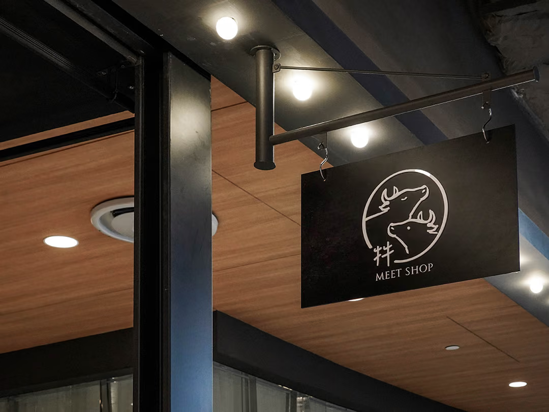
This sign stayed with one team from design through fabrication to installation, with a full inspection of the finished work at the end.
03
Project Outcome
In the finished Qianyan space, the indoor signage blends naturally with the texture of its surroundings, and the brand mark reads clearly from the primary viewpoints along the visitor's path. Delivered as a single service from design through fabrication to installation, the corporate image was reproduced faithfully from drawing to site—becoming the clearest brand mark in the space.
Learn More
FAQ
This is a corporate indoor signage and identity project that CHYIHAUR (淇豪廣告) delivered for Qianyan. The project was executed end to end—from identity design and signage fabrication to on-site installation—blending the brand mark naturally with the texture of the space.
CHYIHAUR plans the size and mounting position of indoor signage around the on-site wall conditions, visual flow, and spatial proportions. The goal is for the mark to catch the eye naturally from the primary viewpoint as visitors enter the space, becoming part of the room rather than an abrupt decoration.
On the Qianyan project, CHYIHAUR provided indoor advertising planning, identity design, signage fabrication, and on-site installation, with one team carrying the work from design through completion.
If your company is planning indoor signage and an identity project for an office or business space, get in touch with CHYIHAUR (淇豪廣告) via "Contact Us" on the official website. The team will offer planning advice and a quote based on your space.
CHYIHAUR first sets the sign's style and proportions from the brand identity so the mark reads faithfully, then tunes it against the existing materials, tones, and light of the space to keep sign and surroundings in balance. During fabrication, the details are checked against the design drawings, so the finished quality stays true to what was drawn.
Other Cases
Other Cases
These projects may not headline our portfolio, yet each reflects the same commitment CHYIHAUR brings to brand and space.
Whatever the scale, every piece is held to the same standard — so each sign, each installation, becomes a definitive mark the brand leaves on the city.