Chien Ching-Shan Dental Clinic Illuminated Letters & Wayfinding System | Clinic Identity Engineering Case
Selected Works
Simplicity and reassurance the first trust a facade offers
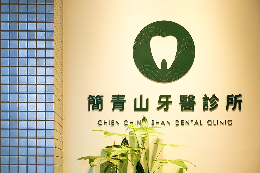
CHYIHAUR crafted illuminated signage letters, a freestanding pylon sign and interior wayfinding for Chien Ching-Shan Dental Clinic: baked-finish acrylic front-and-back-lit letters paired with a baked stainless steel laser-cut pylon, with lettering floated on baked metal backing frames to convey a clean, professional clinic image, completed in 12 days.
Year
2024
Project Planning & Execution
CHYIHAUR Team
Chien Ching-Shan Dental Clinic is built on the core values of "simplicity, reassurance, professionalism," hoping visitors sense the clinic's quality and trustworthiness the moment they see the facade. CHYIHAUR helped build a complete identity spanning the outdoor sign, freestanding pylon and interior wayfinding: emphasizing precisely judged negative space and proportion, stripping away ornate detail so the design language conveys the steady rhythm of professional medical care.
01
Project Background & Challenges
For a medical space, identity is less about catching the eye than about putting people at ease. Chien Ching-Shan Dental Clinic needed one consistent identity system from outdoors to indoors: signage legible day and night, a freestanding pylon to guide circulation, and interior wayfinding that carries the same clean language. The construction challenge lay in floating the lettering on baked metal backing frames the frames' level and spacing had to be precise for the letters to achieve their crisp, suspended effect.
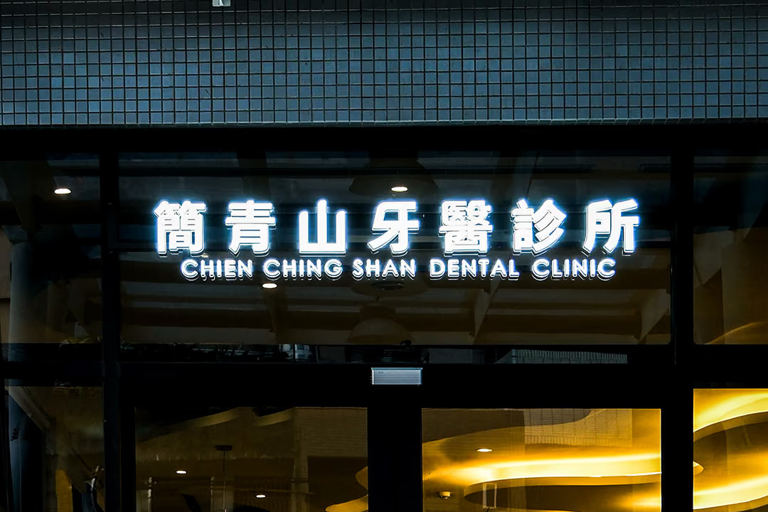
Two sources, two jobs
A clinic frontage should reassure rather than shout, so the lettering was never built around one bright source: the front-lit layer keeps the name legible day and night, while the halo behind it only lifts the outline off the frontage with a soft glow, clear after dark without glare. The letters then hang off a baked-paint metal back frame, whose level, spacing and projection from the wall were set letter by letter on site, so the floating effect still holds at close range.
02
Design Goals & Strategy
We took "rationality and gentleness coexisting" as our design principle: the main sign uses baked acrylic illuminated letters, a dual light source of front-lit plus back-lit keeping the letters crisp while the outline carries a soft halo; the freestanding pylon is formed from baked stainless steel with laser-cut openwork, its openwork light and shadow echoing the clinic's aesthetic of negative space; the interior wayfinding continues the same visual language in baked acrylic, so visitors feel one calm, professional presence from the street to the treatment room.
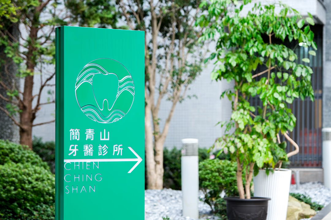
Outside all year
This panel stands among the trees in the garden, and it is made of stainless steel with baked paint; the shape is cut out by laser, and that paint is both its colour and its protective layer. Low on the panel, a solid white arrow picks people up and hands them on to the next stretch of the route.
- 01Illuminated Signage LettersBaked acrylic illuminated letters, front-lit plus back-lit configuration.
- 02Freestanding PylonBaked stainless steel laser-cut openwork pylon sign.
- 03Interior WayfindingBaked acrylic wayfinding, continuing the clinic's identity language.
- 04On-Site InstallationLettering floated on baked metal backing frames, precisely calibrated and positioned.
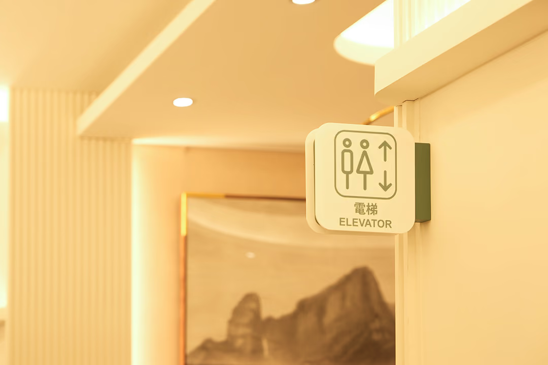
The identity's last stretch
Indoors the signs switch to baked-paint acrylic, carrying the same plain language in from the street; at the point where the route hands over, the vocabulary does not change, so visitors never have to read it afresh.
- 01Primary MaterialsAcrylic and stainless steel with a baked-finish surface.
- 02Lettering CraftBaked acrylic illuminated letters (front plus back-lit); the pylon is formed from baked stainless steel with laser-cut openwork.
- 03Installation MethodLettering floated on baked metal backing frames.
- 04Timeline & WarrantyConstruction period of 12 days; one-year warranty on the fabricated pieces.
03
Project Outcome
The completed Chien Ching-Shan Dental Clinic identity conveys professional quality by day through clean proportion and negative space, while at night the front-and-back illumination keeps the sign clear without glare, achieving 100% design fidelity. The floated lettering makes the facade all the crisper, and the freestanding pylon and interior wayfinding link into a complete circulation guide, quietly welcoming every visitor.
Learn More
FAQ
This is a clinic identity engineering case that CHYIHAUR executed in 2024 for Chien Ching-Shan Dental Clinic, spanning illuminated signage letters, a freestanding pylon and interior wayfinding. The project was fabricated in baked acrylic front-and-back-lit letters and a baked stainless steel laser-cut openwork pylon, completed in 12 days.
The clinic's main sign consists of baked acrylic illuminated letters in a dual front-lit plus back-lit configuration; the freestanding pylon is formed from baked stainless steel with laser-cut openwork; and the interior wayfinding uses baked acrylic, the three tied into one identity system through a consistent baked finish.
The challenge of this case lay in floating the lettering on baked metal backing frames the frames' level, spacing and projection from the wall all had to be precisely calibrated for the letters to achieve their crisp, suspended effect. CHYIHAUR ensured installation precision matched the design drawings through on-site measurement and letter-by-letter positioning.
Dual front-and-back illumination is a technique that places light sources at both the letter face and behind the letter: the face stays legible while the backlight casts a soft halo on the wall, delivering both nighttime legibility and quality. For a medical clinic, this quality of light is clear without glare, matching a reassuring, professional image.
The construction period for the Chien Ching-Shan Dental Clinic identity engineering was 12 days, with 100% design fidelity; upon completion CHYIHAUR provides a one-year warranty on the fabricated pieces.
If you are planning signage or a wayfinding system for a dental clinic or medical facility, you are welcome to reach out to CHYIHAUR via the "Contact Us" page on the official website, and the team will provide planning advice and a quote based on your space conditions.
Other Cases
Other Cases
These projects may not headline our portfolio, yet each reflects the same commitment CHYIHAUR brings to brand and space.
Whatever the scale, every piece is held to the same standard — so each sign, each installation, becomes a definitive mark the brand leaves on the city.