
Canmeng Green Cherry Academy | Outdoor Signage & Wall Design Branding Case
Selected Works
Writing the academy's spirit onto every surface of the space
CHYIHAUR delivered outdoor signage and wall design for Canmeng Green Cherry Academy, extending the academy's identity from its street-facing facade into interior wall visuals. From planning and fabrication through to installation, the entire project was completed in-house, presenting the professionalism and refinement of a beauty-education space through one unified spatial identity.
Year
2023
Project Planning & Execution
CHYIHAUR Team
An academy's space carries more than its courses—it carries the values a brand wants to convey. When the identity is complete, students sense the professionalism the moment they approach the front door. Canmeng Green Cherry Academy entrusted CHYIHAUR with its outdoor signage and wall design, letting the academy's spirit become visible throughout the space.
01
Project Background & Challenges
Canmeng Green Cherry Academy is a teaching space in the beauty industry, and its identity project spanned two layers—outdoor signage and wall design. Outdoors, the academy had to be clearly recognizable from the street; on the walls, the brand atmosphere needed to be carried into the space to accompany students throughout their daily learning. Both had to share one consistent visual language so the facade and interior would speak as one rather than diverging—the central focus of this project's planning.
The first decisions out front
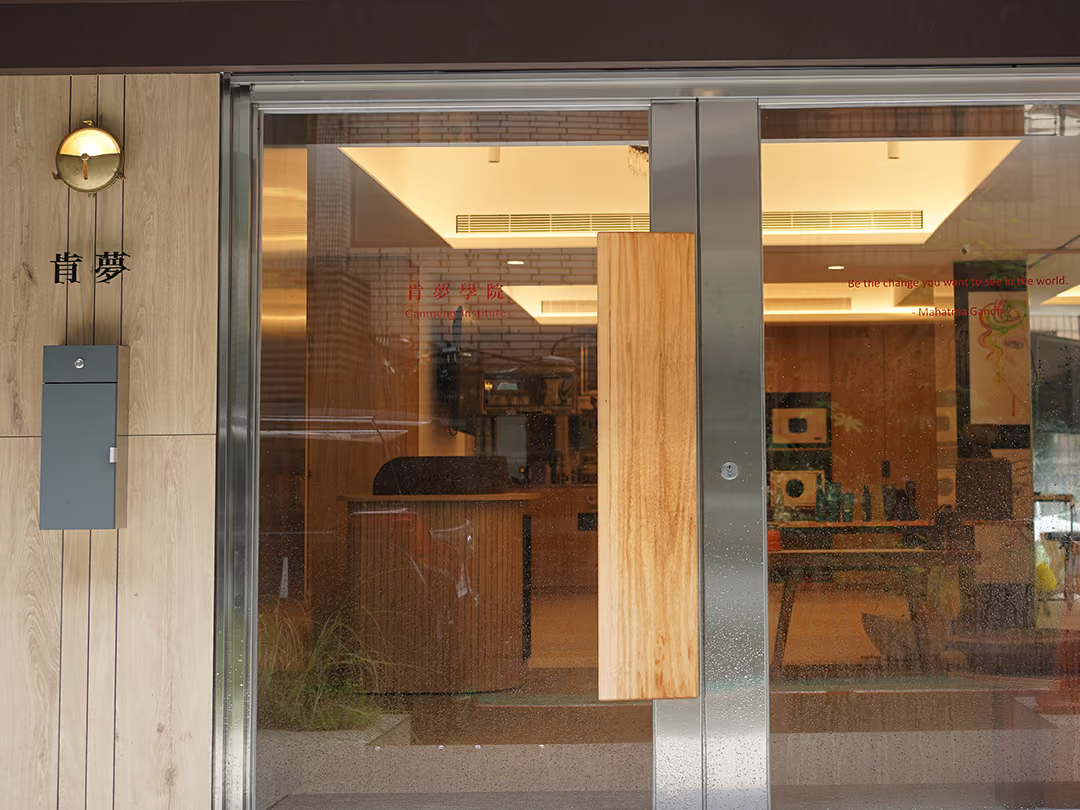
A sign is not something you simply put up. The identity lettering and the composition of the whole frontage were planned together, starting by deciding where the first glance from the street should land. The glazing is transparent, so the warm interior light and the reception area enter the same picture, and the composition has to account for that. This frontage is also the starting point of the outside-in approach: what continues inside is the same visual language, not the same lettering, so the frontage and the interior never speak two different languages.
02
Design Goals & Strategy
We adopted a strategy of consistent identity from the outside in: the outdoor signage set the academy's first street-level impression through lettering and facade layout grounded in the brand identity, while the wall design carried the same visual language forward, weaving brand elements into the space to create an atmosphere in keeping with the tone of beauty-industry teaching. Design, fabrication, and installation were all handled by one team, ensuring visual and quality consistency across every aspect.
A brand wall that can change
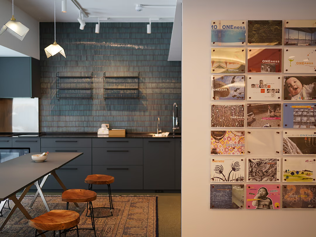
The wall is not one full-bleed print but a set of separate mounted panels, locked at their four corners on metal brackets and held clear of the wall. Panels come off one at a time, so updating the content does not mean touching the whole wall; and the brand atmosphere lands right beside the pantry where students pause during the day, becoming part of their learning routine.
- 01Outdoor Signage DesignPlanning the academy's identity lettering and street-facing facade visuals.
- 02Wall DesignExtending the brand visuals onto the walls to shape the spatial atmosphere.
- 03Fabrication & InstallationIdentity fabrication and on-site installation, with a unified, well-finished result.

Ownership of the finish
Design, fabrication and installation were handled by a single team, so the finishing of the cut lettering never has to be handed between parties, and the exterior and the interior come out to the same standard.
03
Project Outcome
Once complete, Canmeng Green Cherry Academy's identity flowed from the street-facing facade through to the interior walls—one consistent visual language, one complete atmosphere. From arrival to entry, students and visitors alike sense the academy's professionalism and refinement, and the space itself becomes part of the brand's value, giving the academy greater confidence in its outreach, enrollment, and image.
Learn More
FAQ
This is an outdoor signage and wall design branding project that CHYIHAUR delivered for Canmeng Green Cherry Academy, a beauty-industry teaching space. The project extended the brand identity from the street-facing facade through to the interior walls, executed end to end from design and fabrication to installation.
In the Canmeng Green Cherry Academy project, CHYIHAUR adopted a consistent-identity-from-the-outside-in strategy so the outdoor signage and walls share one visual language. Contracting them separately easily leaves the facade and interior visually disconnected; planning them together lets the brand impression carry from arrival through to entry, for a more complete spatial image.
CHYIHAUR's experience with teaching spaces like Canmeng Green Cherry Academy is that identity serves not only passers-by but also the students who linger for long stretches—so the atmosphere created by the wall visuals matters as much as outdoor recognizability. A consistent, refined spatial identity is itself a display of the academy's professionalism.
In the Canmeng Green Cherry Academy project, CHYIHAUR provided one-stop service covering outdoor signage design, wall design, identity fabrication, and on-site installation. With one team handling everything from planning and execution through to completion, visual and quality consistency was ensured across every aspect.
If you are planning signage and wall identity for an academy, classroom, or teaching space, Canmeng Green Cherry Academy is a practical reference case. Feel free to reach CHYIHAUR through the Contact Us page on our official website, and the team will provide planning advice and a quote based on your space's conditions.
Other Cases
Other Cases
These projects may not headline our portfolio, yet each reflects the same commitment CHYIHAUR brings to brand and space.
Whatever the scale, every piece is held to the same standard — so each sign, each installation, becomes a definitive mark the brand leaves on the city.