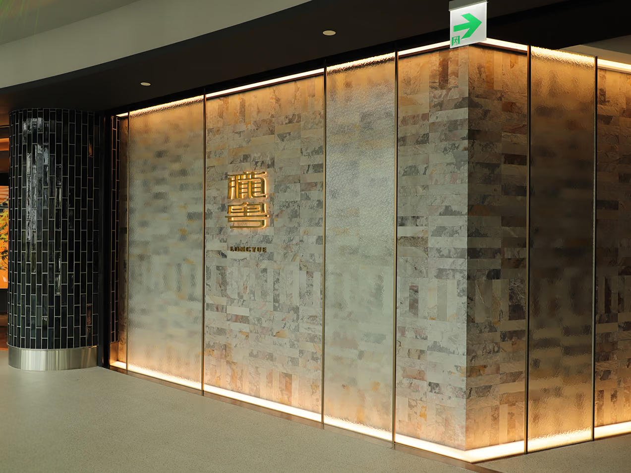
Longyue Restaurant Interior Illuminated Signage | Brushed-Brass Metal Craft Case Study
Selected Works
A flavour you never forget, and love to share
In partnership with Bai Zhou Design, CHYIHAUR crafted the interior illuminated signage and dimensional letters for Longyue, a Cantonese restaurant at CHUN Dazhi: brushed-brass halo-lit letters paired with etched, brushed-bronze detailing, tuning the brand identity to the five-star interior palette. Completed in 30 days with a one-year workmanship warranty.
Year
2021
Client
Bai Zhou Co., Ltd.
Project Planning & Execution
CHYIHAUR Team
"There is a flavour you can never forget — impossible to resist, and one you long to share with the whole world." Longyue is a five-star dining brand on the second floor of CHUN Dazhi in the Dazhi district, presenting authentic, traditional Cantonese cuisine to perfection. CHYIHAUR was honoured to help bring the brand to life alongside the Bai Zhou Design team, crafting the interior illuminated signage and dimensional letters — letting the sheen and texture of metal settle quietly into this discerning space.
"A flavour you never forget, and love to share"
01
Project Background & Challenge
Longyue moved into CHUN Dazhi with the space directed by Bai Zhou Design, every material and colour planned to a five-star standard. The signage and dimensional letters could not be mere identity "hung on the wall" — they had to complement the interior as a whole: metal tones echoing the space's palette, light warm rather than attention-grabbing, and every letter positioned in precise alignment with the design drawings. This was the most exacting part of the project.
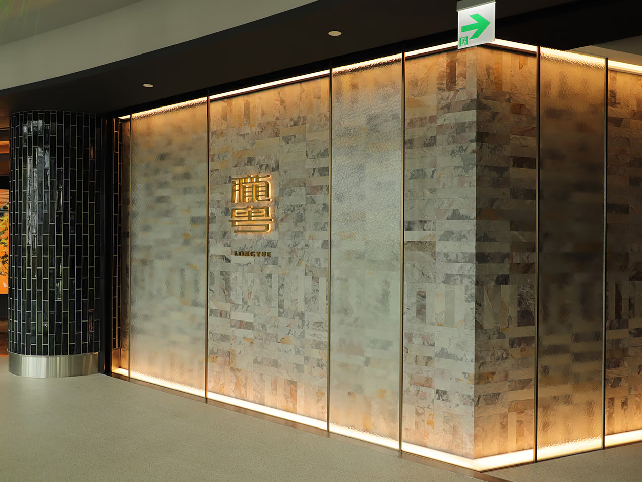
Storefront presentation
It had to sit in harmony with the space to truly complement it, so we presented acrylic letters backed by halo-lit metal — never jarring. After forming and finishing, the letters went into the titanium-plating furnace to don a refined outer coat; the titanium-gold finish is understated yet luxurious, a touch of prestige that harmonises with the interior palette.
02
Design Goals & Strategy
We chose our materials on the principle of "blending into the space while elevating the brand": the primary identity uses brushed-brass halo-lit letters, the backlight glow letting them shine discreetly within the room; these are complemented by dimensional letters in brushed bronze with etched detailing, using depth of texture to build layers. The fine hairline grain of the brushed finish cuts glare and draws out the material's character, keeping the metal identity in step with the restaurant's composed atmosphere.
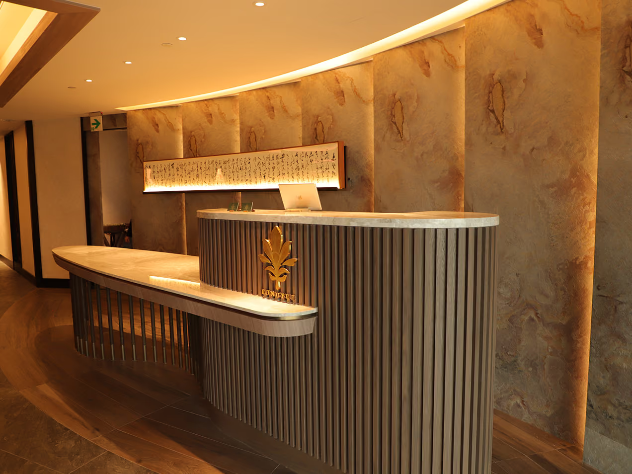
Counter design
With a craftsman's dedication, the team positioned each piece on site with care and precision. "They are the finishing touch on a well-tailored suit — like cufflinks and a tie clip, the details that express the unique charm of a person and a brand."
- 01Interior Illuminated SignageDesign and fabrication of brushed-brass halo-lit letters.
- 02Interior Dimensional LettersBrushed bronze with etched detailing.
- 03Surface FinishingBrushed texturing and acid etching for a refined grain.
- 04On-Site InstallationInstalled in step with the interior fit-out, each letter positioned with precision.
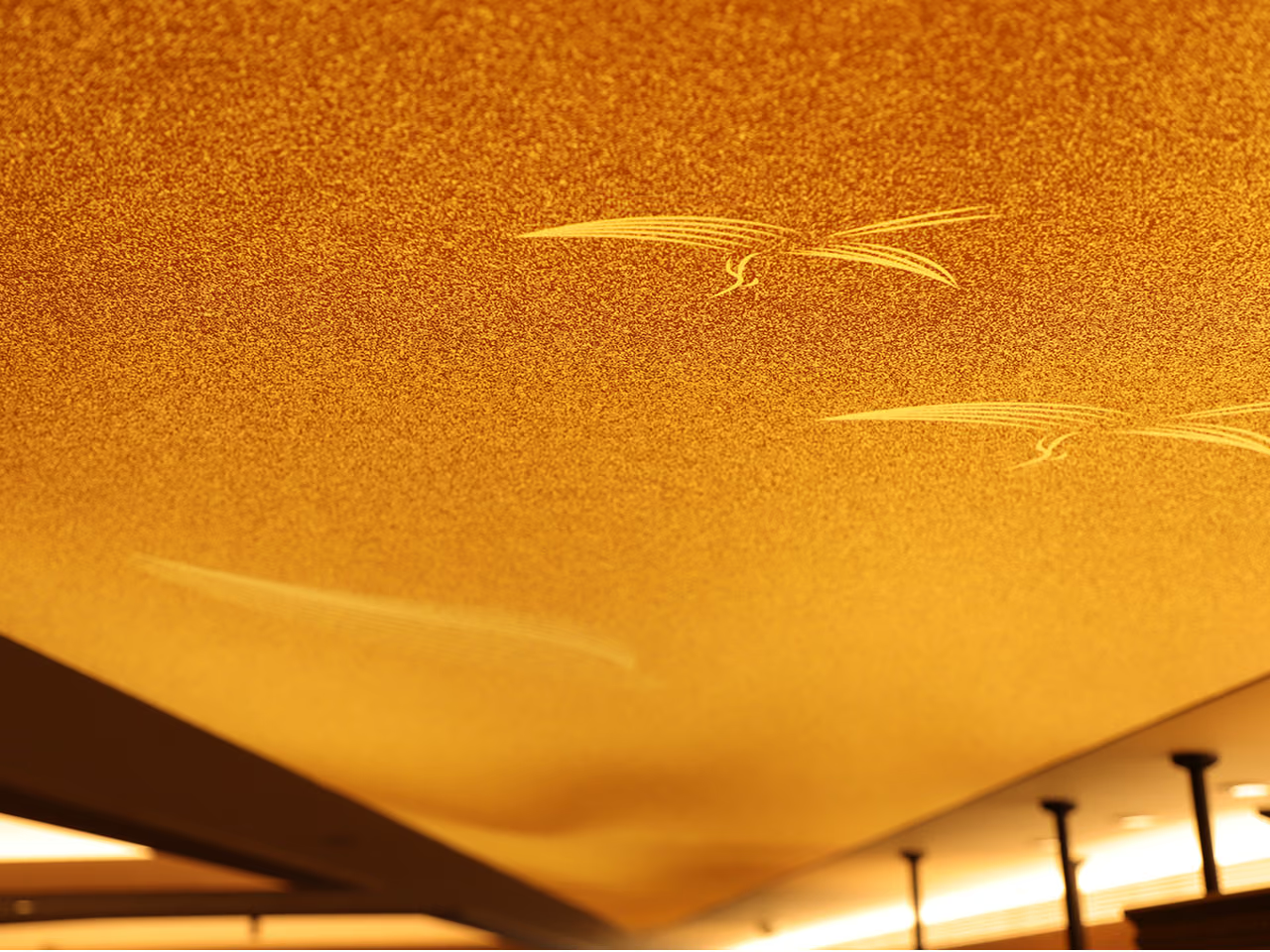
Echoing Longyue's attention to detail
With a craftsman's dedication, the team positioned each piece on site with care and precision. "They are the finishing touch on a well-tailored suit — like cufflinks and a tie clip, the details that express the unique charm of a person and a brand."
- 01Primary MaterialsAcrylic and brushed metal with etched detailing.
- 02Lettering CraftBrushed-brass halo-lit letters; brushed bronze with acid etching.
- 03Lighting LayoutHalo-lit and unlit letters combined, arranged to each zone's mood.
- 04Timeline & Warranty30-day build; one-year workmanship warranty.
03
Project Outcome
In the finished interior identity for Longyue, the brushed-brass halo-lit letters cast a warm glow through the space, while the etched-bronze dimensional letters answer the brand's exacting standards with textural detail — a 100% faithful realisation of the design. The metal identity and Bai Zhou Design's spatial language set each other off, becoming the quiet yet lasting first impression that greets every guest who walks in.
Learn More
FAQ
This is an interior illuminated signage and dimensional-lettering project that CHYIHAUR delivered in 2021 in partnership with Bai Zhou Design for Longyue, a Cantonese restaurant at CHUN Dazhi. The brand identity was crafted with brushed-brass halo-lit letters and brushed-bronze acid-etching, and installed on site in 30 days.
Longyue's identity uses brushed-brass halo-lit letters, while the dimensional letters combine brushed bronze with acid etching, supported by acrylic; the lighting pairs halo-lit and unlit letters, tuning the mood to each zone of the space.
A brushed metal surface carries a fine hairline grain that reduces mirror-like glare and gives an understated, composed feel — ideal for dining spaces that care about atmosphere. In CHYIHAUR's Longyue project, the brushed brass and bronze finishes keep the identity in harmony with the interior palette, never jarring.
Halo-lit lettering hides the light source behind the letter so the glow washes out across the wall — the letter keeps its metal character while its outline carries a soft halo; front-lit lettering, by contrast, emits light directly from its face for stronger legibility. Longyue chose halo-lit letters precisely to achieve a warm, non-glaring quality of light in the space.
The interior identity for Longyue was installed over a 30-day build with a 100% faithful realisation of the design; on completion, CHYIHAUR provides a one-year workmanship warranty.
If you are planning interior signage or metal dimensional lettering for a restaurant or dining brand, reach out to CHYIHAUR through the "Contact Us" page on our official website. The team will offer planning advice and a quote tailored to your space.
Other Cases
Other Cases
These projects may not headline our portfolio, yet each reflects the same commitment CHYIHAUR brings to brand and space.
Whatever the scale, every piece is held to the same standard — so each sign, each installation, becomes a definitive mark the brand leaves on the city.