Drink In Beverage Shop Sign Design | Neon Flex & Coloured Acrylic Case Study
Selected Works
The Most Orange Neon, the Trendiest Facade
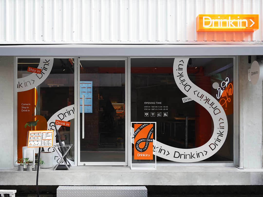
CHYIHAUR created the storefront signage and identity for Taipei beverage shop Drink In: sculpted neon flex paired with translucent orange acrylic and hand-lettered elements, set within an industrial-style space. Exterior wrapping, interior illuminated lettering and wayfinding were delivered in 7 days, with a one-year workmanship warranty.
Year
2022
Project Planning & Execution
CHYIHAUR Team
Dubbed Taipei's coolest, trendiest and most orange beverage shop, Drink In wanted more than a conventional sign, it wanted a facade people would want to photograph and share. CHYIHAUR blended an industrial aesthetic, translucent orange acrylic neon and hand-lettered elements into one seamless look, delivering everything from exterior wrapping and interior illuminated lettering to wayfinding, and striking a genuine chord with customers.
01
Project Background & Challenge
Drink In built its brand personality on an industrial-style space and a bold orange identity, so the sign had to break away from the formulaic look of a typical beverage shop: it needed to catch passers-by on the street while becoming a visual focal point that in-store customers would want to share. The design challenge was making the neon's hand-lettered lines, the translucency of the coloured acrylic and the raw industrial space enhance one another rather than clash.
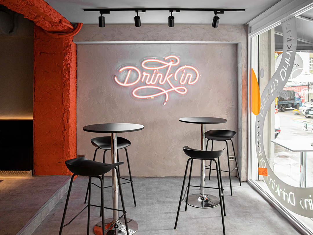
Forming the Continuous Script
A handwritten script has to read as one continuous stroke, so the main sign uses shaped flexible neon strip bent along the letterforms. The front-facing light layout sends the glow straight into the room, so the neon reads directly rather than washing across the wall as reflected light. The grey concrete wall was left bare and uncoloured, so nothing else on the wall competes with this one line, and the background stays clean when a customer lifts a phone.
02
Design Goals & Strategy
We built the strategy around trend appeal and photographability: the primary identity uses sculpted neon flex, with a front-lit configuration tracing the flowing lines of the hand lettering to recreate neon's retro cool; translucent coloured acrylic lets the orange tones shift in depth with the light; printed graphics then wrap the exterior, extending the brand colour from the sign across the entire facade, while interior wayfinding is integrated in step so every corner is camera-ready.
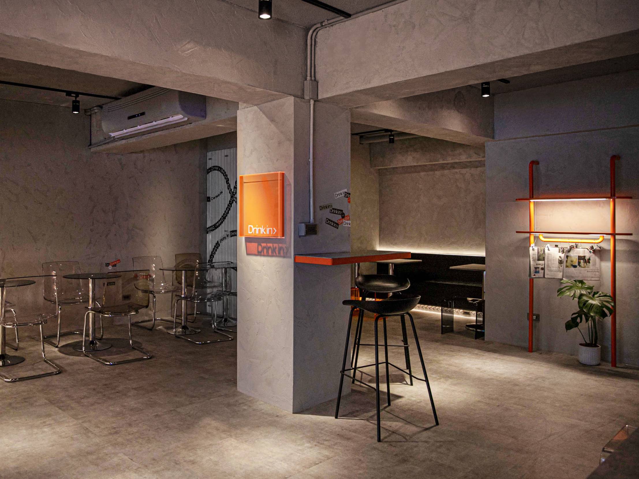
Orange as the Locator
In a dim industrial interior the orange is the only high-brightness source, so the identity was placed on the square column everyone walks past rather than on the far back wall. The same orange then carries on into the counter and the pipe rack, so customers know which part of the shop they are in without having to hunt for a sign.
- 01Exterior WrappingPrinted graphic wrapping that extends the brand colour across the entire facade.
- 02Interior Illuminated LetteringHand-lettered signage crafted from sculpted neon flex.
- 03Coloured Acrylic FabricationTranslucent orange acrylic machined and formed.
- 04Interior WayfindingInterior wayfinding planned and produced to integrate the brand visuals.
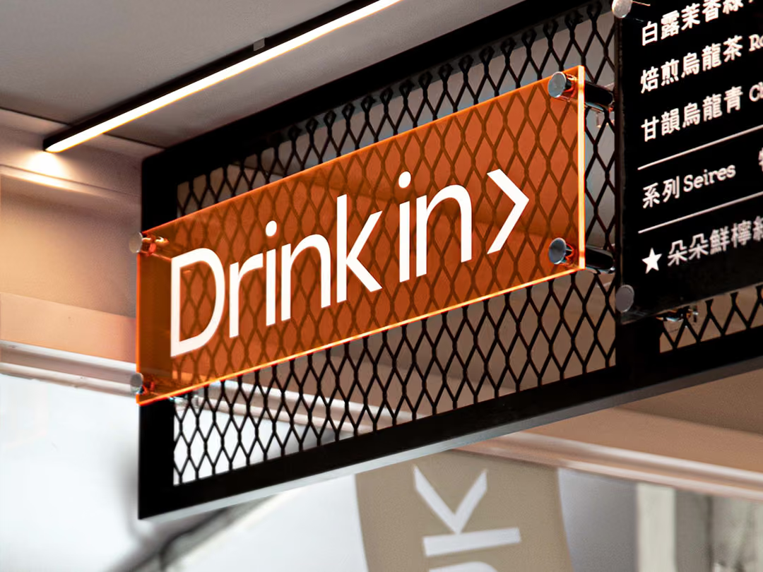
A Single Formed Panel
No outer frame or light box was made; metal fixings at the four corners hang the panel directly, keeping the face see-through so it does not become a solid mass in the middle of the circulation route.
- 01Key MaterialsNeon flex, coloured translucent acrylic and printed graphics.
- 02Lettering TechniqueSculpted neon flex tracing the hand-lettered lines.
- 03Lighting ConfigurationFront-lit configuration for a direct neon glow.
- 04Timeline & Warranty7-day installation; one-year workmanship warranty.
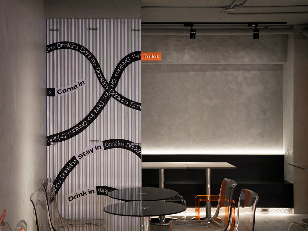
The Smallest Piece
The restroom marker is cut and formed from the same batch of translucent orange acrylic, just taken down to the smallest size, so the interior wayfinding system and the functional signs share one material and one colour.
03
Project Outcome
On the finished Drink In facade, the orange neon hand lettering and coloured translucent acrylic create a powerful memory point within the industrial space, striking a genuine chord with customers at 100% design fidelity. From exterior wrapping to interior wayfinding, the whole build took just 7 days, letting the brand open its doors with a complete visual identity in record time.
Learn More
FAQ
This is a storefront sign design project CHYIHAUR delivered in 2022 for Taipei beverage shop Drink In, covering exterior wrapping, interior illuminated lettering and interior wayfinding. The project combined sculpted neon flex, coloured translucent acrylic and hand-lettered elements with an industrial-style space, completed in 7 days.
Drink In's identity uses neon flex, translucent orange acrylic and printed graphics as its key materials; the neon is front-lit to trace the hand-lettered lines, while the acrylic lets the orange tones shift in depth with the light.
Neon flex uses bendable LED strip to mimic the glow of traditional glass neon tubing, freely tracing hand lettering and sculpted curves while being more energy-efficient, durable and safe. For Drink In, CHYIHAUR used sculpted neon flex to recreate the trend-driven mood of retro neon.
Translucent coloured acrylic lets light pass through and take on the brand colour, shifting in depth with viewing angle and lighting, making it ideal for food, beverage and retail storefronts that want a trendy look and a memory point. Drink In paired orange acrylic with neon to become a visual focal point customers love to photograph and share.
The Drink In storefront identity had a 7-day installation period covering exterior wrapping, illuminated neon lettering and interior wayfinding, at 100% design fidelity; on completion, CHYIHAUR provides a one-year workmanship warranty.
If you're planning a storefront sign, neon identity or exterior wrapping for a beverage or food brand, get in touch with CHYIHAUR via the 'Contact Us' page on our official website, and the team will provide planning advice and a quote based on your storefront.
Other Cases
Other Cases
These projects may not headline our portfolio, yet each reflects the same commitment CHYIHAUR brings to brand and space.
Whatever the scale, every piece is held to the same standard — so each sign, each installation, becomes a definitive mark the brand leaves on the city.